Marketing
How to create a landing page (in 45 mins or less)
Creating an effective landing page is a fundamental skill for any email marketer looking to drive conversions and maximize the impact of their campaigns. In today’s digital landscape, where attention spans are short and competition is fierce, a well-designed landing page can make all the difference.
However, as email marketers, creating landing pages doesn’t always fall under our remit. And as with all things we try our hand at for the first time, it can be quite daunting.
So, with that in mind, we decided to put together a short, step-by-step guide for you. We’ll share some valuable insights and practical tips to help you design landing pages that resonate with your audience and drive results.
What is a landing page?
A landing page is a standalone web page designed to serve as the entry point for visitors who arrive through a specific marketing campaign or channel. Unlike other web pages on a website – which may have multiple purposes and navigation options – a landing page is highly focused on a single objective, such as capturing leads, promoting a product or service, or encouraging a specific action.
While there are several different types of landing pages, typically, they are built with the intention of driving conversions by encouraging visitors to take a desired action, such as filling out a form, making a purchase, or signing up for a newsletter. They are often used in conjunction with email marketing campaigns (and other marketing channels) to deliver targeted messaging and guide visitors through the conversion funnel.
Creating a landing page: Step-by-step process
Now that we’ve defined what a landing page is, let’s go through the process of creating one. We’ll run through how to set-up and prepare your campaign, settle on a design layout and copy, before finally integrating and testing its performance.
Let’s get started.
Step #1 – Define your goals
Defining goals for a landing page involves identifying the specific outcomes you want to achieve through visitor interaction with the page. These goals should be aligned with your overall marketing objectives and tailored to the purpose of the landing page. Now, it’s essential to clarify your goals early in the process to ensure that the design, content, and set-up of the landing page are optimized to support them effectively.
If you’ve not done this before, one tried and tested goal-setting framework for you to work within is SMART. It stands for:
|
SMART |
Description |
|---|---|
|
Specific |
Your goal shouldn’t be vague like “get more leads.” Instead, aim for something like “increase newsletter signups by 15% within the next quarter.“ |
|
Measurable |
You need a way to track progress. This could involve sign-up form metrics, sales figures, or even video engagement rates depending on your goal. |
|
Attainable |
While you should challenge yourself, aim for a goal that’s realistic within your timeframe and resource limitations. |
|
Relevant |
Your landing page goal should directly connect to your overall marketing objectives. Are you trying to build brand awareness, generate leads, or drive sales? |
|
Time-bound |
Set a specific deadline for achieving your goal. This creates a sense of urgency and helps you measure progress along the way. |
Step #2 – Settle on a layout
Once you’ve identified your goal and the action you want visitors to take (download an eBook, sign up for a free trial, register for a webinar) you can start thinking about the layout. A well-structured layout guides visitors down the landing page, highlighting key points and leading them towards taking that desired action.
Now, there are some general best practices you will want to keep in mind when thinking about layout. For example, a traditional lead capture page typically follows a problem-solution-benefit framework: you start off by clearly outlining the pain points your audience or customers face, then gradually showcase your solution and its benefits as a potential answer.
This can be achieved by adding a Hero Section: a large banner with a captivating headline, before leading into the benefits of your offer (can be via video, bullet points, or a short description) and closing out with a prominent call-to-action (CTA) button. This is just a classic, tried and tested layout used to great effect by many brands over the years. You can of course play around with different elements as you see fit.
Finally, it’s crucial that the landing page be optimized for mobile devices. Research from our 2024 Email Engagement Report shows more than 71% of people check their email on a mobile device. If subscribers are accessing your emails from their mobile devices, it’s fair to say that if they click on the CTA, they will be sent to a mobile version of your landing page.
Check out Sinch Mailjet’s guide to creating responsive emails for some solid advice on preparing your campaigns for mobile. If you’re already using our platform, you can take advantage of the responsive Email Editor as well as mobile-friendly templates.
Step #3 – Choose a landing page template
After you’ve got a good idea of how you’d like to lay out your landing page, you can save some time by selecting an appropriate template. Most built-in landing page builders have a selection for you to choose from.
Even for experienced email marketers, templates can be an asset. They free up time so you can hone your copy, streamline the creation process, and allow for quicker campaign launches.
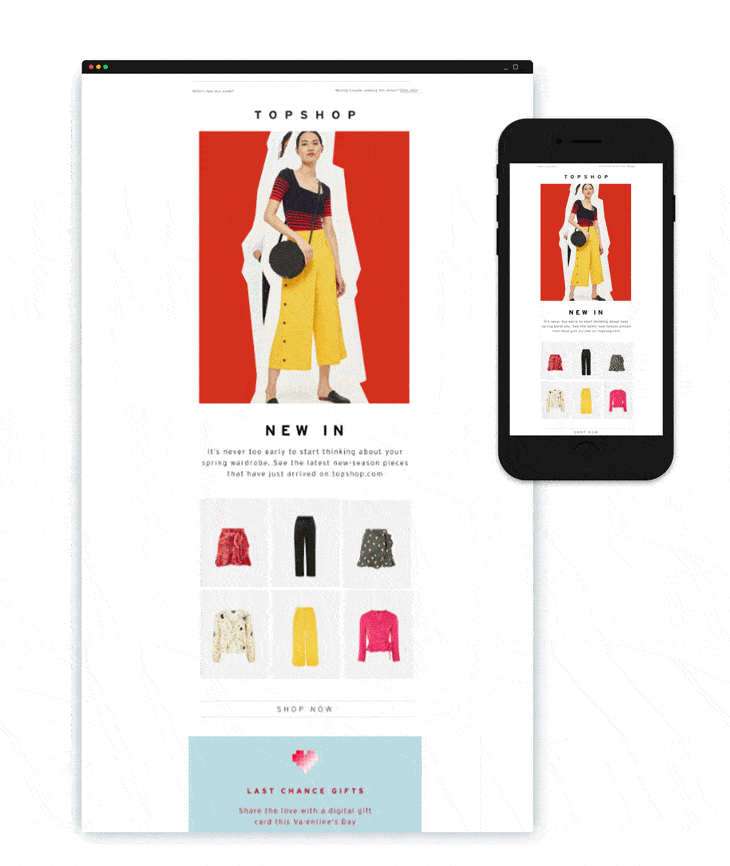
Sinch Mailjet also offers a wide range of professional newsletter templates for you to choose from. This ensures that visitors have a seamless, connected brand experience when interacting with each campaign, from email right through to the landing page.
Step #4 – Write your copy
Your landing page copy is like a salesperson for your product, service or offering. It has one shot to grab the visitor’s attention, explain what you offer, and convince them to take action. Therefore, it’s important to follow a few best practices when it comes to writing copy:
- Stand-out headline: This is going to be the first thing readers see after arriving to your landing page, so you need to craft an attention-grabbing headline that captures their interest and entices them to read on. Make it concise, impactful, and relevant to what was highlighted in the email.
Synchronize with email campaign: We wrote an entire article on why you need to
align your email campaigns with landing pages. Creating that seamless experience across brand channels for visitors – especially brand voice – creates a sense of familiarity and trust, which hopefully translates to higher engagement and conversion rates on your landing page.- Clear value prop: Clearly communicate the value and benefits of what you are offering to visitors. Highlight what sets your product or service apart and why they should click on that CTA.
- Concise messaging: Keep your copy clear, concise, and focused to convince visitors to take the desired action, whether it’s signing up for a newsletter, downloading a resource, or making a purchase.
- Benefits-oriented content: Focus on the benefits rather than just the features of your product or service. Explain how it will solve the visitor’s problem or improve their life, and why they can’t afford to miss out.
- Compelling CTA(s): Use clear and compelling CTAs that prompt visitors to click through. Make them stand out visually, use active language, and create a sense of urgency or scarcity to encourage immediate action.
Step #5 – Think about visuals
Visuals are a key element of landing pages because they are what stand out and grab a reader’s attention. And with the fast-paced digital landscape you’re competing on, people are quickly overwhelmed with information, and tend to scan webpages, so impactful images and graphics can quickly communicate your message.
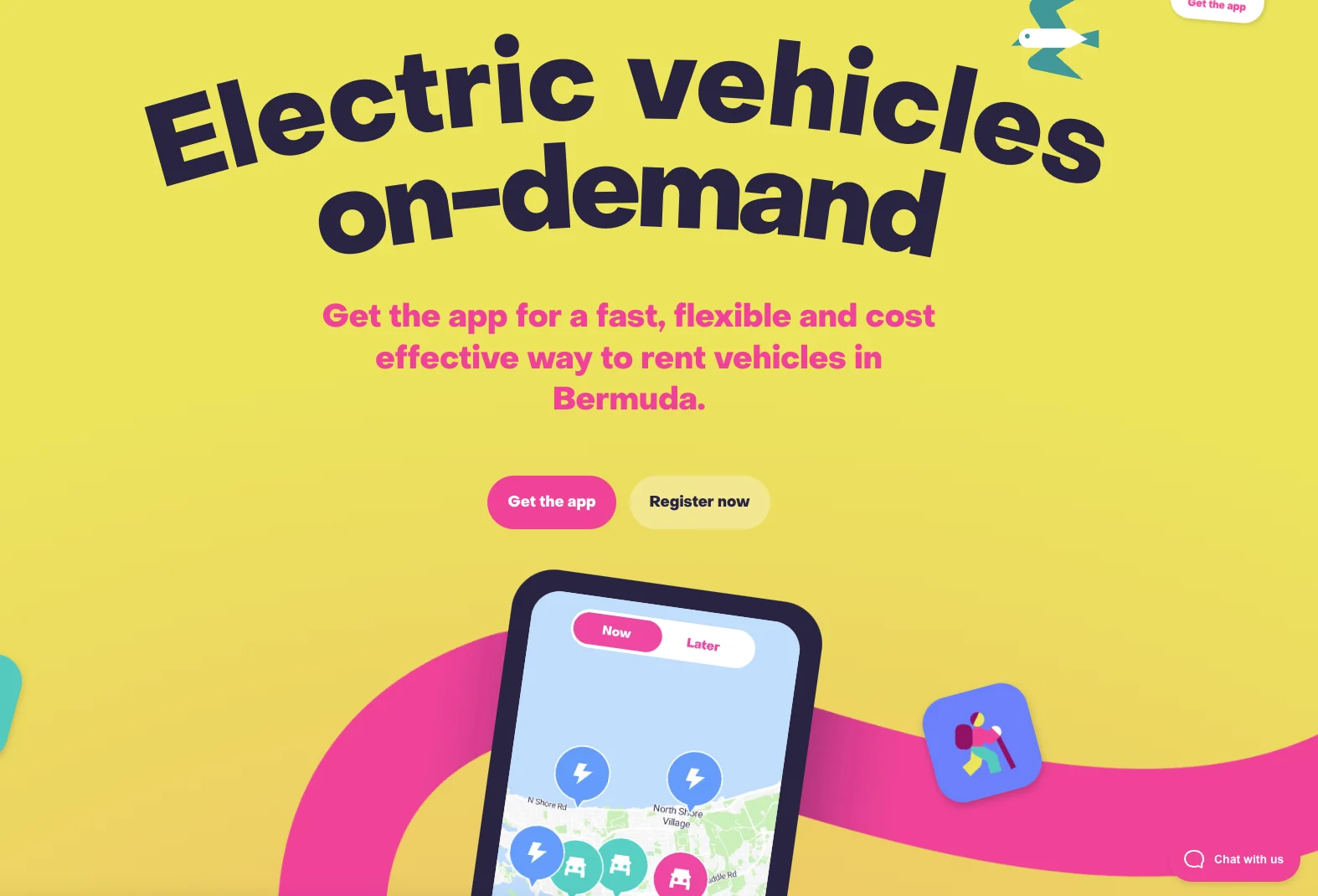
Take a look at this example from the Bermuda-based car rental application Current. The British archipelago is well-known for its pink sandy beaches and tropical climate, and Current have taken full advantage of that fact by integrating those impactful, stand-out colors to draw visitors into their landing page:
Beyond simply grabbing a visitor’s attention, visuals can also build trust and credibility. High-quality photos of your product or service show professionalism, while images of happy customers add social proof. By strategically using visuals, and ensuring they align with the overall messaging and goals you have set up for the campaign, you can create a more engaging and persuasive landing page that effectively converts visitors, into leads or customers.
Step #6 – Add your CTA
Once you’ve convinced visitors to take a leap of faith and head over to your landing page, you’d like them to convert, right? It’s likely you didn’t solely create this landing page out of the goodness of your heart (or maybe you did?)
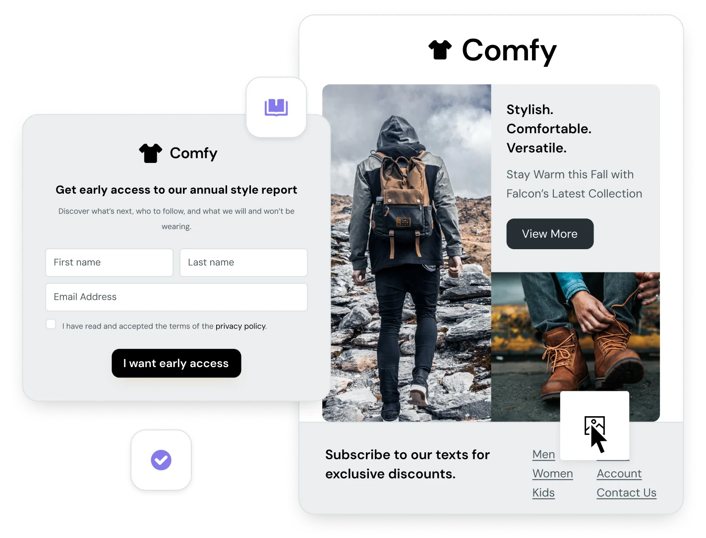
To do, so marketers typically include a CTA button. For example, this landing page from Product Video Examples encourages visitors to click on a CTA titled – Get access to 100+ videos now – where presumably, we will be sent to a video library:
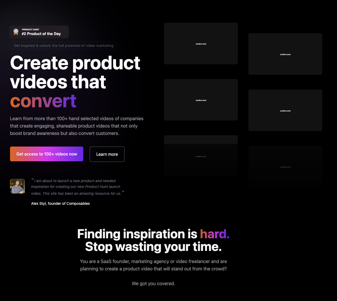
It’s simple, clear, and effective. But other than clarity and concision, what are some other elements to consider when creating CTAs?
- Urgency: Sometimes, creating a sense of urgency can nudge visitors in the right direction. Phrases like “Limited Time Offer” or “Download Before It’s Too Late!” are some potential examples.
- Colors: Make sure your CTA button stands out from the background. Use contrasting colors, a clear border, and a size that’s easy to see (as well as click or tap). Note how in the example above the CTA starkly contrasts with the black background it’s set upon.
- Action verbs: Start your CTA text with a strong verb that tells users exactly what to do. Words like “Get“, “Download“, or “Start” are all great choices.
Another tactic for encouraging visitors to take action is to add social proof to your landing page. Most people are not willing to take your claims on a leap of faith and would rather see hard evidence that your product or service does exactly what it is supposed to. And what better way to do this than through the confident backing of existing customers?
This can be done by including customer testimonials, case studies, product reviews, and user ratings on your landing pages. When visitors see that others have had positive experiences or found value in your offering, they are more likely to trust your brand and feel confident in handing over their contact details.
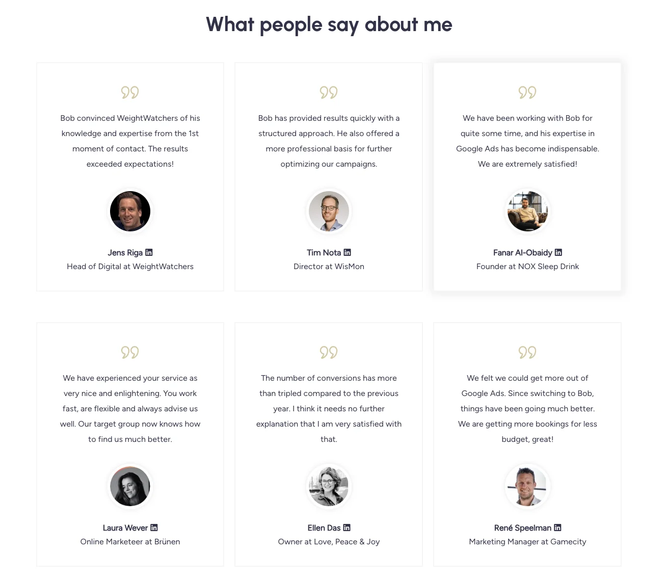
Notice how Bob Meijer gathered customer testimonials to reinforce confidence in his brand and services.
Step #8 – Get feedback
Getting feedback on your landing page is a crucial step in ensuring a successful campaign by catching errors and optimizing the user experience.
Typos, broken links, or incorrect code can all create a negative first impression for visitors. A preview helps identify these issues before you hit send or create on that landing page builder.
Also, if you’re adding some type of lead capture form to the page, is it obtaining information correctly? Do the CTA buttons function as intended? How does it appear when loaded on a mobile device? Again, a preview allows you to test all the interactive elements of the page and rectify anything that’s gone amiss.
Step #9 – Time to publish your landing page
Once all the creases from your preview are ironed out, the broken links are fixed, and you’re happy with the landing page, it’s time to hit publish!
But your work hasn’t finished just yet…
Step #10 – Test, test, and test again
While you may have published your landing page, at this point, it’s likely you’re working primarily based on an assumption of how your audience will react. However, your assumptions about what resonates with your target audience might not always be on point.
This is where A/B testing comes in.
Testing your landing page exposes it to your actual audience, and their behavior on the landing page provides valuable insights. You can see what elements grab their attention, what confuses them, and ultimately what convinces them to take action. This knowledge helps you refine your future landing pages to better resonate with your target audience.
Some of the different elements you can A/B test include:
- Form fields
- Copy
- Design
- CTA buttons
- Messaging
- Interactive media
You can identify which variations perform best in terms of conversions and use that data to inform your future decision making.
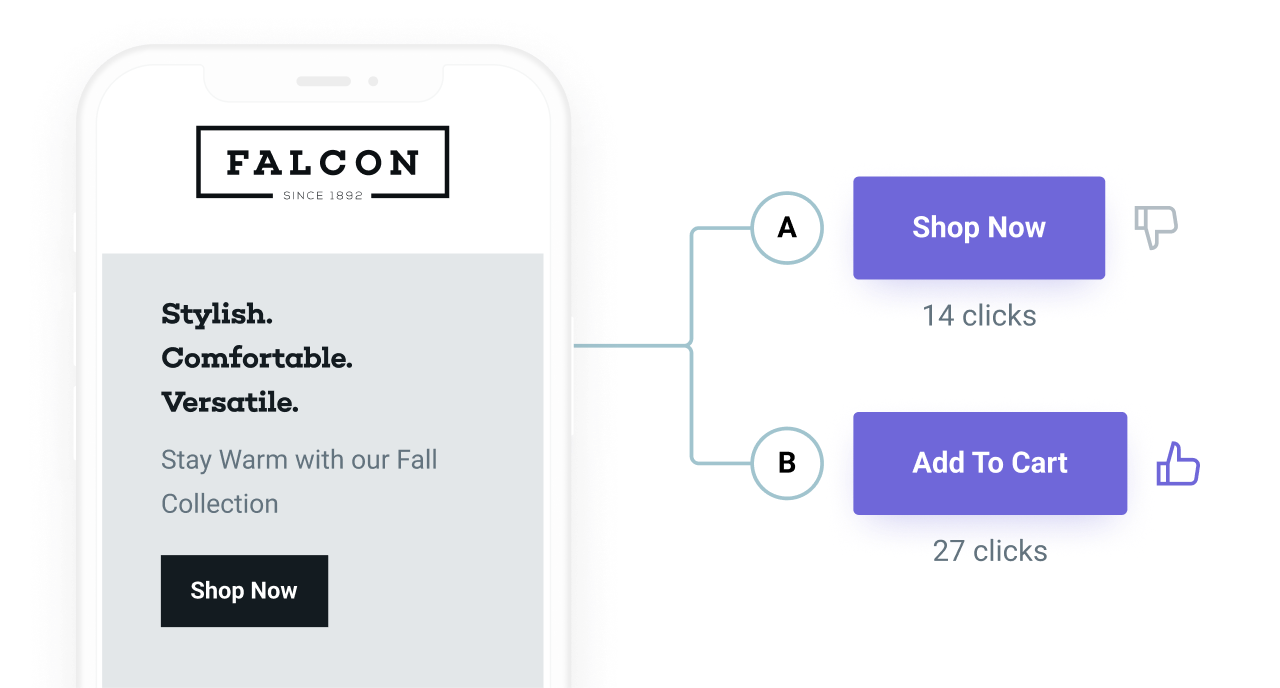
Running an A/B test on an element as simple as different CTA texts or colors can have a huge impact on conversion rates
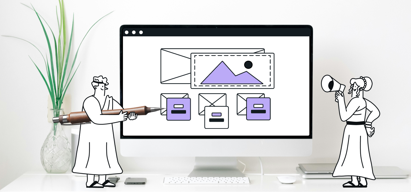
Create landing pages with Sinch Mailjet
So, now that you know how to create a landing page, you might be wondering if there’s a tool to that can swiftly combine them into your current email marketing strategy.
Good news, there is! Sinch Mailjet now offers a drag-and-drop landing page builder directly within our email marketing platform. With our new tool, you will have access to pre-built templates that are easily optimized to closely align with your email marketing campaigns.
You can seamlessly integrate forms – including custom fields – to collect valuable visitor data as well as sync leads with email lists, allowing for targeted follow-ups and nurturing.