
Guide to creating responsive emails


In the past, when you received a non-responsive email, you blamed the phone, you gave it a shake, or you might even have tried the classic but miraculous technique of closing and reopening the app. That was then, when our inboxes still seemed like remote digital paradises.
Now, how many emails do you get a day? 20, 30, 100? I wouldn’t know where to start counting them. For a while now, when I get an email that looks odd, with cut-off images and blocks aligned so strangely that the whole thing looks like a Picasso, I’ve deleted it without further ado. And I’m not the only one: 80% of people would delete an email that doesn’t display properly on their mobile device.
For this reason, in a world where mobile is king and people like me don’t appreciate all the effort that goes into your newsletters and campaigns, deleting them without the slightest hint of remorse, responsive email design is crucial.
Responsive email design is not a new online phenomenon, but if you aren’t a designer or don’t work in digital marketing, you might not be quite sure what it is.
A responsive – also called adaptive – design is a design that adapts and displays properly on screens of various sizes. For example, avoiding an image being wider than the screen or the user having to increase or reduce the size of text to be able to read it.
Although here we’ll be talking about email design, this technique can also (and especially) be used for web page design and layout. Why is it so important for design, both of emails and web pages, to adapt to various devices? Well, this is almost a rhetorical question, but we wanted to add a touch of suspense.
An article on Email Monday claims 59% of emails sent today are opened on mobile devices, and only 15% are opened on a desktop. And the same is true of web search: almost 60% of Internet searches are done on mobiles. Both of these are more than good enough reasons for brands to want to make the user experience as easy and intuitive as possible.
First and foremost, the main factor that affects how a user views an email is undoubtedly the device type. Email is accessed differently on a desktop computer, Samsung Mini, and a digital watch.
On a desktop, the screen is much larger and we have a mouse to help us navigate, scroll, and click easily on text links or buttons, however small they are.
On a phone, the story is somewhat different. Here the proportions of the content are reduced to fit on the micro screen of a latest generation mobile (although truth be told some phones are more like tablets). So, images are smaller, the text more compressed, and you need to scroll much more to reach the end.
The other big enemies of responsive email are email clients themselves. If you’re unfamiliar with this term, an email client is a program that allows you to send and receive emails, and manage an email account effectively. The best-known email clients are Gmail and Outlook, but there are many more and each one displays email in its own way.
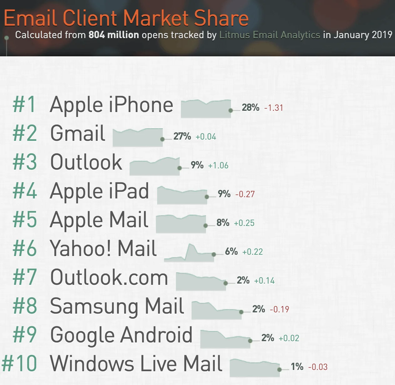
So what can we do, then? Don’t panic. As the image shows, the top five email clients pretty much have a monopoly, so you can start by adapting your emails based on this data.
These top five email clients have a market share of over 70% between them, so we should prioritize adapting our emails for mobile to be read in these clients.
When we talk about optimizing email design, we have a number of options of varying simplicity and effectiveness. These are the main options:
Scalable design is the most basic method of adapting your emails. The content of an email of this kind will simply be scaled up or down to adapt to the user’s screen size, but without changing the structure of the email or the layout of the content.
These types of email are the easiest to develop, but in truth scalable design does not deliver the best results.
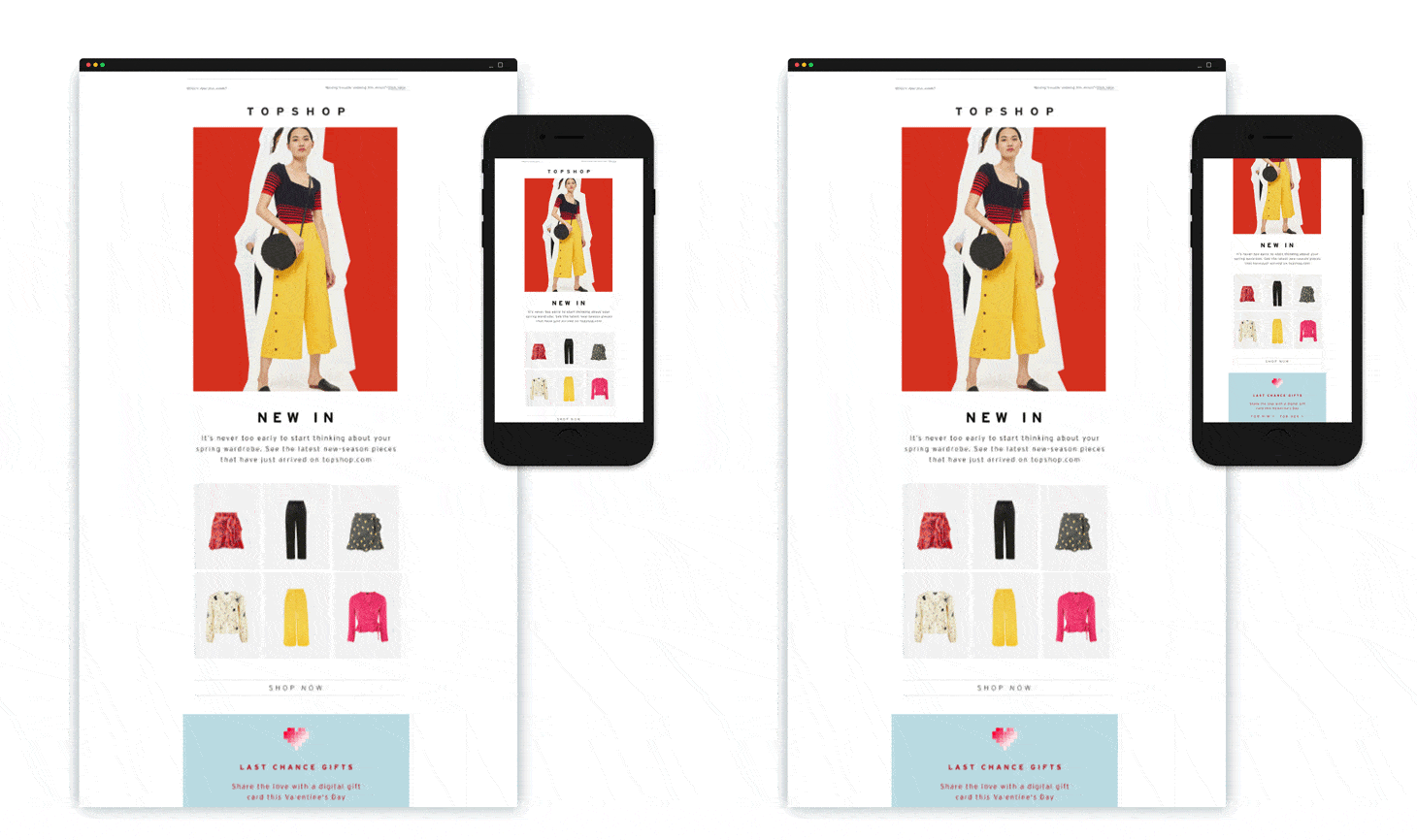
Source: Ondho
Fluid design uses percentage-based sizing to make blocks of content adapt automatically to the screen size of the device. In other words, the content “flows” from the desktop version into the various screen widths, filling the space as the screen width varies.
This format typically works best for text-heavy emails, but it is also very hard to get the layout right.
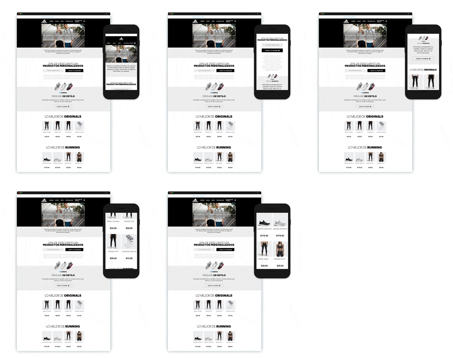
Source: Ondho
Of the three types, responsive design delivers the best viewing experience on all screen sizes. What sets it apart is that it ensures each device displays a different version of the message, optimized for the specific screen size.
Laying out emails like this is quite a complex task, but the good news is that Passport, Mailjet’s drag and drop email editor, allows you to create responsive newsletters by default. We’ll come back to Passport at the end of the post.
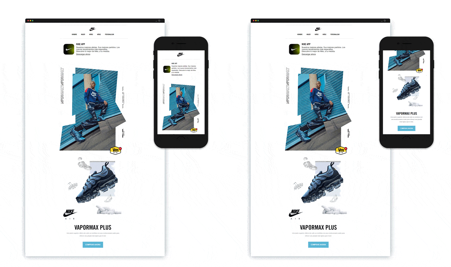
Source: Ondho
If you use an email editor like ours, you don’t have to worry about media queries, CSS and equally unfamiliar concepts: the editor does everything for you. However, there are other things that might interfere with the end result, and here we’ll tell you what they are and how to avoid them.
One of the most common email design errors is using a layout with multiple columns. It might happen because we get carried away by creative urges (or emotion), but this first decision could result in an epic email adaptability fail.
This is because the vast majority of mobile devices have a vertical screen design, forcing them to shrink anything with a wider format, including emails with several columns.
So what’s the solution? Opt for a single-column design; this will ensure that web browsers and email clients display the content of your email in the right proportions, and you won’t have to re-adapt the design to smaller screen sizes. When it comes to mobile devices, simplicity is your friend!
Take a look at some of the faults we’ve taken directly from our inboxes.
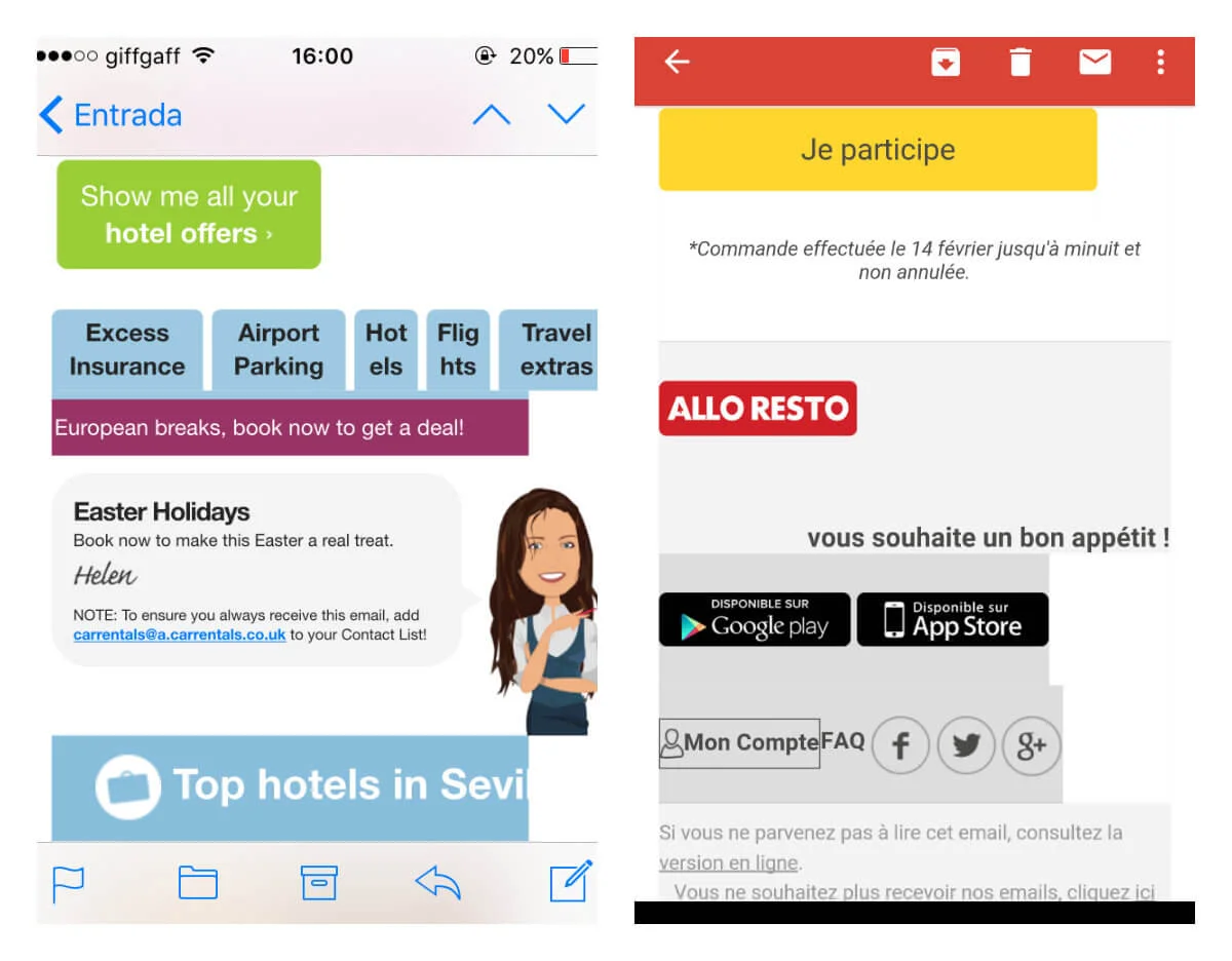
Images (and gifs) are a fantastic way of making emails more dynamic and attractive. But in responsive email design, images can be a double-edged sword.
When it comes to images in email, the (not so big) secret is not to use exaggeratedly outsized or undersized images. If you use overly big images, you run the risk that emails will not display properly or will take a long time to load. And, believe us, nobody is going to wait more than three seconds before moving on to the next email.
On the other hand, using overly small images will not deliver better results either. In fact, what we will probably get are distorted or pixelated images.
To make sure your images display properly and adapt to any device, use images that can adjust to the size of your newsletter: you can cut them down to the exact size before uploading them to your email template or, better still, use an email editor like Mailjet’s so you can edit them directly in your template.
Despite all the effort we put into selecting appropriately sized images, it might be that from time to time they still do not display correctly. The fault may lie with email clients, which manage the visual content of emails differently, or users themselves who, for various reasons, prefer to block images by default.
But don’t despair! A simple and effective solution is to add Alt Text (alternative text) to accompany the image and display when the image does not. This text is particularly important for two reasons. Firstly, it tells users they are not seeing the missing images relating to the text. Secondly, emails that contain this tag have a better reputation with email clients, because spammers generally don’t bother adding it.
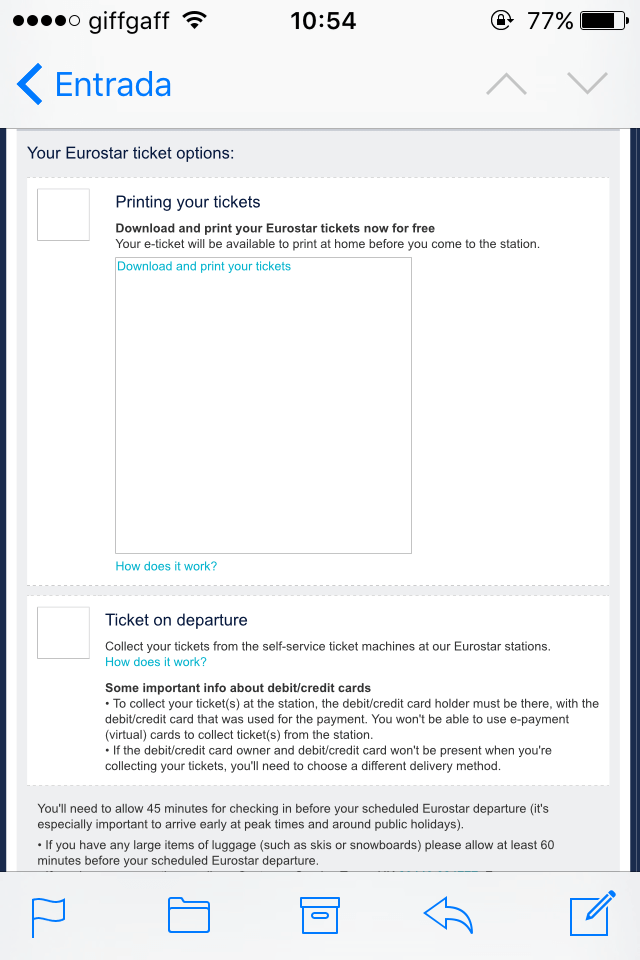
Talking of spammers, another ill-advised technique is to create emails that only contain images, and we’re sure you can guess why. It’s a very risky choice, partly because these messages often end up in the spam folder, but also because, as we just said, if for any reason the images don’t display correctly we have no way of reaching our contact.
Remember: For your email to be effective, aim for a text to image ratio of 60:40.

If you would like to know more about images in email, take a look at this guide.
A basic element of any email design is the call to action (CTA), designed to orientate readers and encourage them to perform a specific action.
If we don’t include clear instructions for our recipients, they might be unsure what to do with our email and move on in a nanosecond. This is also why CTAs and links should be easy to identify and point in exactly the right direction.
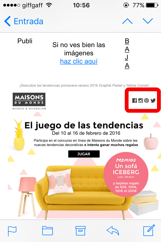
When you design a CTA for a responsive email, make sure the buttons are clearly visible by using, for example, a color that contrasts with the palette you’re using, and big enough so everyone can pick them out easily. As we all know, some people are prone to “fat finger errors”!
And of course, no links in the text or image format: these types of CTA can be much harder to select and, in the case of images, even see. Lastly, be careful where you put your buttons and avoid putting them too close together, as in the example below.
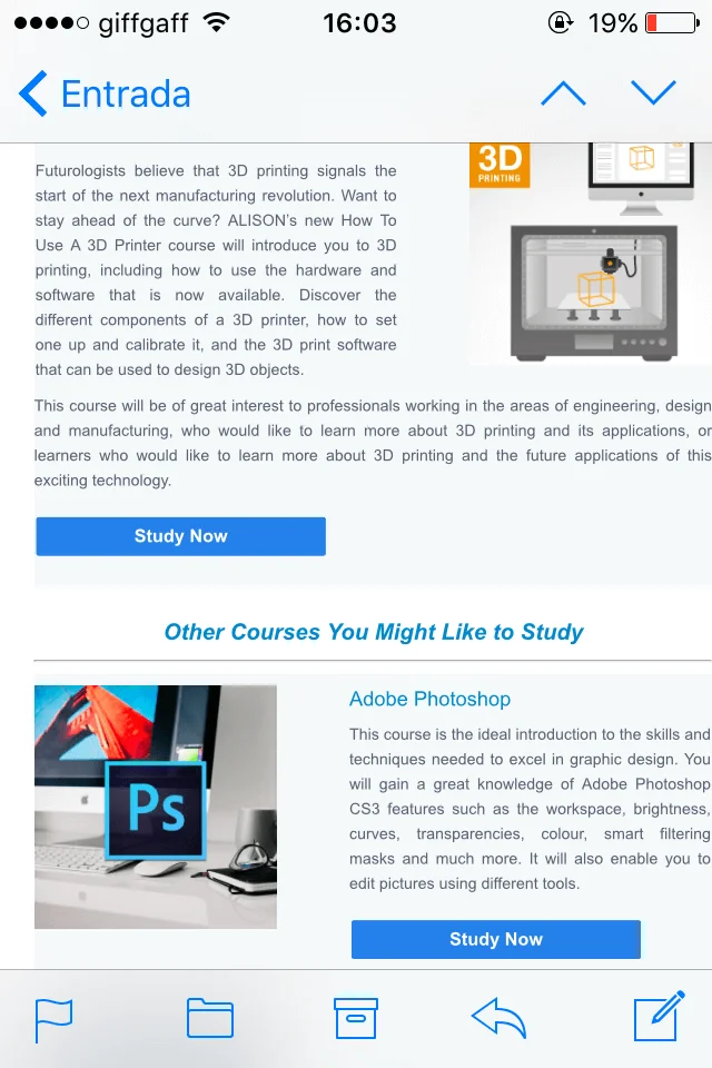
The text is one of the aspects we should adapt to make sure people who open our messages on these devices don’t feel overwhelmed by tiny fonts and interminable paragraphs.
In a web browser, there are a number of techniques you can use to grab a reader’s attention: use colors, arresting images, elegant fonts etc. But on devices with small screens, like smartphones, this is the role of the hierarchy. The hierarchy must be clear to ensure readers grasp the essence of our message, even if they don’t reach the bottom of the page.
People receive a huge number of emails every day, so the competition is huge and it’s increasingly hard to get people to read them. That’s why we should always design our emails with the order of importance in mind, putting the most relevant items first.
As for the text itself, make sure your emails are legible. Don’t aim too high with your use of fonts: opt for a standard font available on any device, like the classic and timeless Arial, Georgia, Times New Roman or Verdana.
Likewise, in this instance size does matter, so be kind to your readers and use a typeface large enough that they don’t need glasses to give your latest newsletter a once over.
Lastly, don’t forget to leave white spaces between one block of content and the next: you’ll make the email look clearer and more modern, without exhausting your subscribers.
So far we’ve discussed the dos and don’ts of responsive email. After so many bad examples (it’s not our fault our inbox is full of them), we want to show you an example of an especially good email while reviewing all the key things to bear in mind when you design your own.
Courrier International is a French weekly newspaper that analyzes the news in the international press. It offers subscribers a daily newsletter with the most important news of the day from all around the world.
It may be that at first you don’t notice any major differences between the two emails (the desktop and mobile versions), so we’ll take a look at them and dissect what makes it a good responsive email.

You’re good to go and we’re sure that, if you’ve followed our advice, you have in front of you a perfectly responsive email that’s ready to send. But, before you launch your campaign, it’s always a good idea to make some final checks. Here are three ways to check how your email design displays.
Use the preview panel in your editor to view how your mail shapes up on different devices. For example, in Mailjet you can view the mobile and desktop versions of your completed email and get a clear idea of how it will appear in your subscribers’ inboxes.
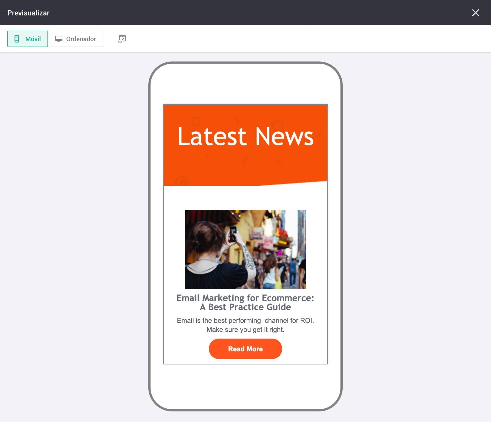
Another everyday way of checking is to send yourself a test email. You can send it to your own address, to a colleague or a friend with access to various devices, browsers and operating systems to make sure nothing untoward happens to your email along the way. At the end of the day, having an extra pair of eyes to check the content and links and test out the UX is no bad thing.
Extra tip: Go into the reports on previous campaigns and filter them to view the breakdown of devices and the use of email clients by recipient, and you’ll be able to check which ones your customers use most.
Lastly, for the most meticulous among you we recommend supplementing steps A and B with platforms such as Litmus and Email on Acid. These two tools send your email to more than 50 email clients and give you analysis and previews, saving you time and offering you peace of mind.
If you have no coding knowledge (or don’t fancy wrestling with HTML code), you can use our email editor Passport to create professional newsletters that adapt to any device and email client. You just need to drag and drop the blocks of content you want to include in your email, such as images, headings, texts, buttons and social media icons.
Another option, for those days when you’re lacking inspiration, is to choose one of the ready-to-edit templates from our “template gallery”, all of which are of course responsive. You just need to select one and edit it to include your content, et voilà!
Want to cast your eye over our templates? Create a free account and check them all out.
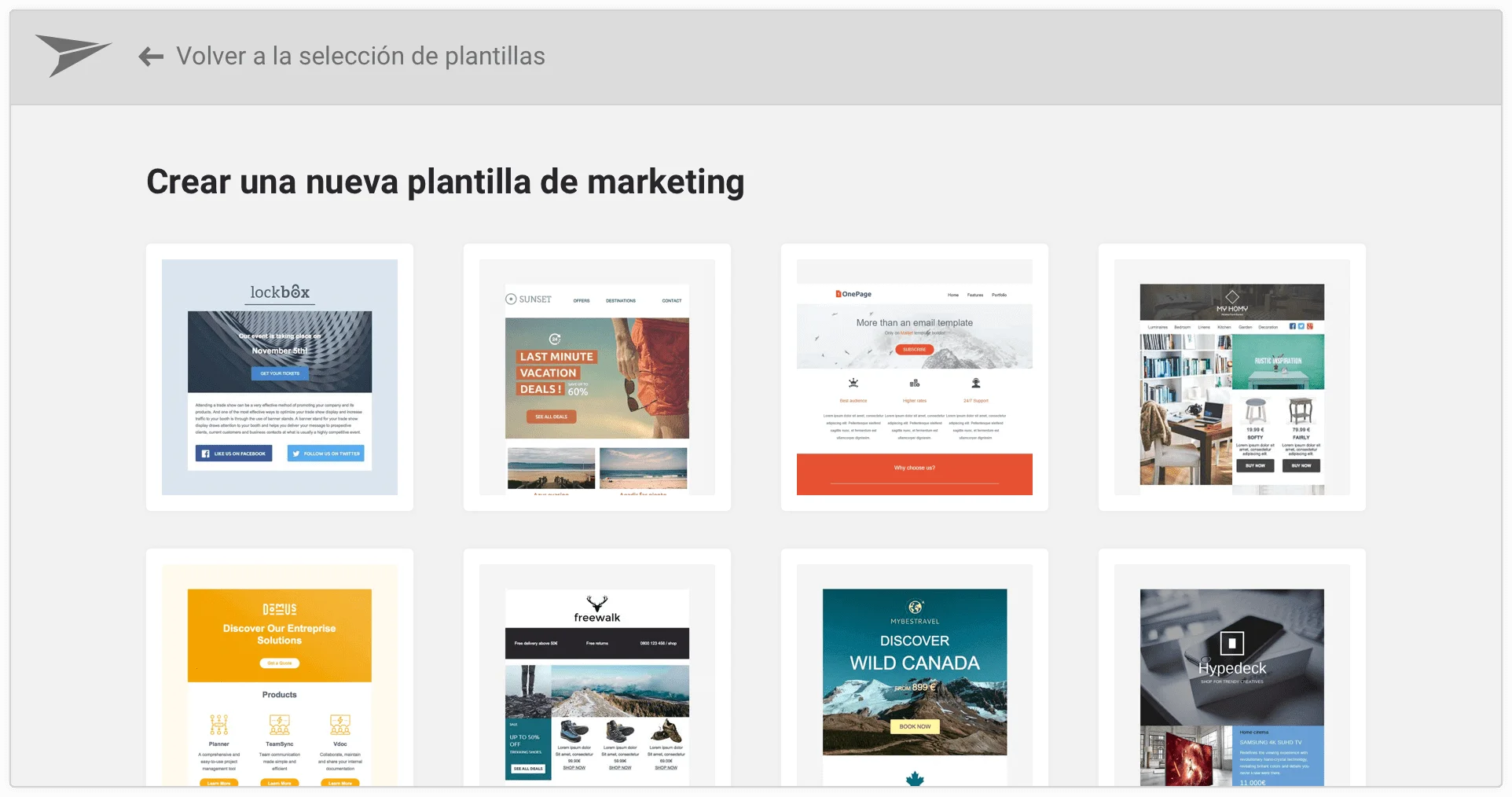
In Mailjet we also offer a solution for more advanced users which has won over developers all around the world. MJML is our open code framework that makes coding an email much simpler and faster. It will take you half the time, you’ll use half the lines of code needed to code with HTML, and adaptability is assured. Don’t believe us? Have a look for yourself.
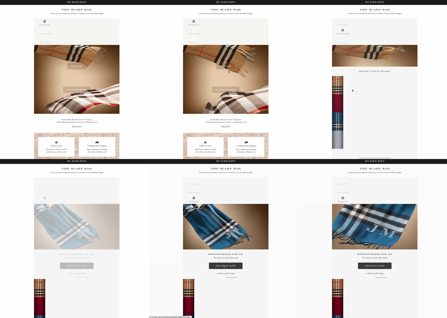
We hope we’ve put to rest all your doubts about responsive email and design; we know it’s not a simple topic. However, if you follow the advice and best practice in this post (and you use our templates), your valuable newsletters will look their best.
Before you get to work, here is a summary of what we’ve covered:
Do you have any other tips for ensuring your emails are responsive? Share your ideas with us on Twitter!

