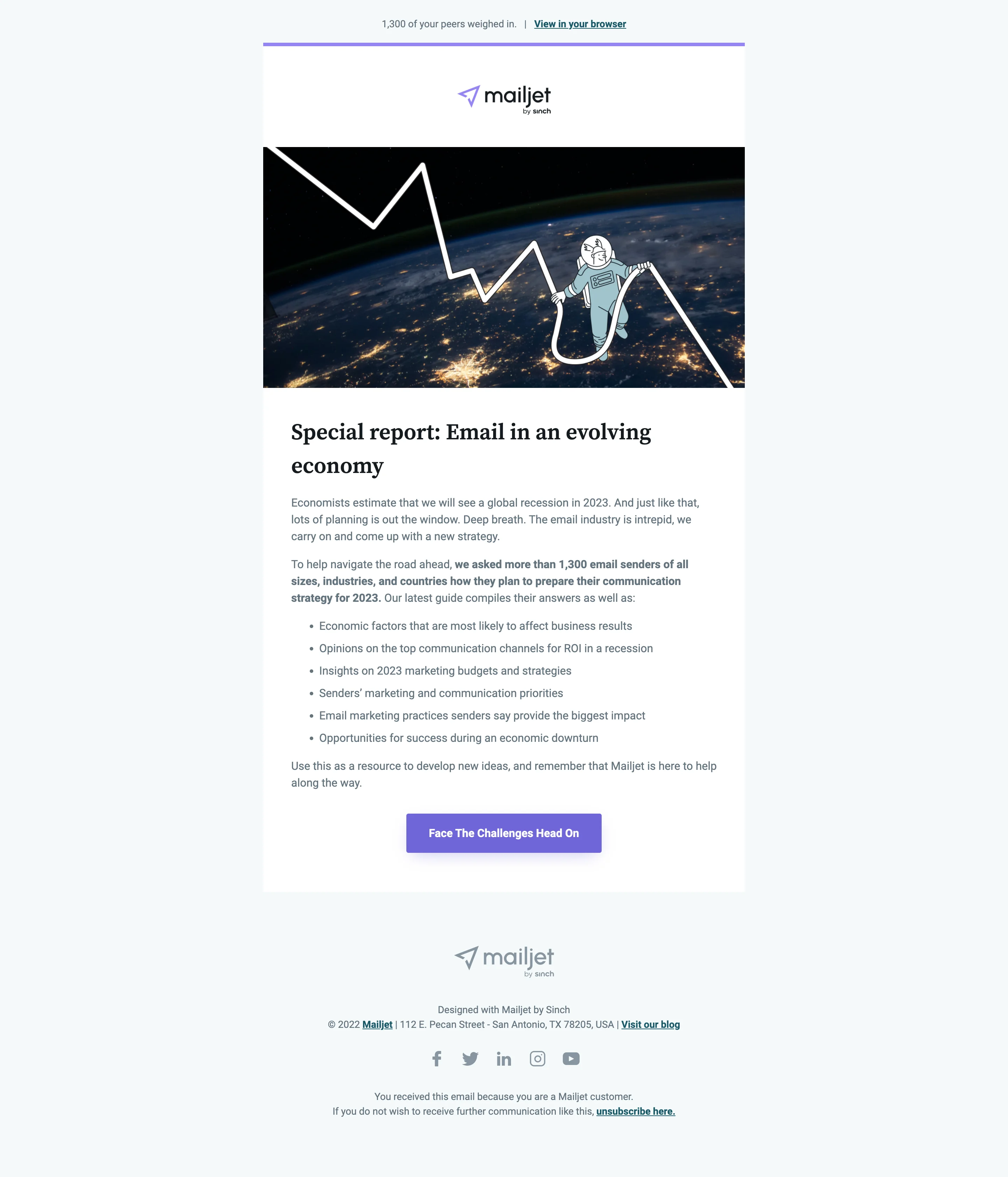
Email best practices
How to create the perfect newsletter design
It’s typically frowned upon to use a pre-mixed cake mixture when baking a cake. Somehow, it’s considered cheating if you don’t shed blood, sweat, and tears to create something special. But when it comes to newsletters, you don’t need to start from scratch when there are design fundamentals, email best practices, and free design tools at your disposal.
Whether you’re a nonprofit organization or ecommerce website, everyone can reap the benefits of a weekly, fortnightly, or monthly newsletter. If you run an existing newsletter, it might be time for a design refresh to represent your ever-evolving brand.
Whatever your newsletter needs, we’ve devised the ultimate newsletter pre-mixture and recipe to help you move swiftly through this project. It’s time to preheat the oven.
Think about the newsletters that you have stayed subscribed to for the longest time – what do they all have in common? Nine times out of ten, we stay subscribed due to the value we consistently receive from these emails.
Yet from the perspective of the marketer, it’s important the right messages are being conveyed in line with marketing goals and KPIs. Keeping both plates spinning is what makes running a successful company newsletter so challenging.
On the bright side, once you’ve created your first email newsletter design, it will just be a case of iterating on the original by testing new ideas.
Pretty newsletters are nice to look at, but high-quality newsletters have intent behind every header, CTA, and image. That’s why it’s essential to set time aside to plan, gather, and structure your newsletter. This way, the actual creation stage should slot into place almost by itself seamlessly.
Hence, the creation stage is just one of the six steps we’ve outlined in our infographic below.
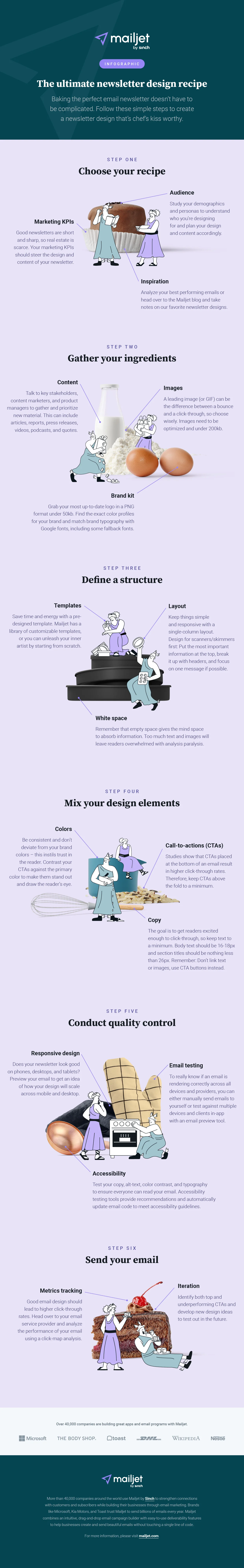
We’ve taken the guesswork out of designing the perfect email newsletter by breaking down the process into six simple steps. Make sure to factor in breaks between each stage (or substage) of this recipe, though. Unlike traditional baking, newsletter baking can’t be completed in a couple of hours.
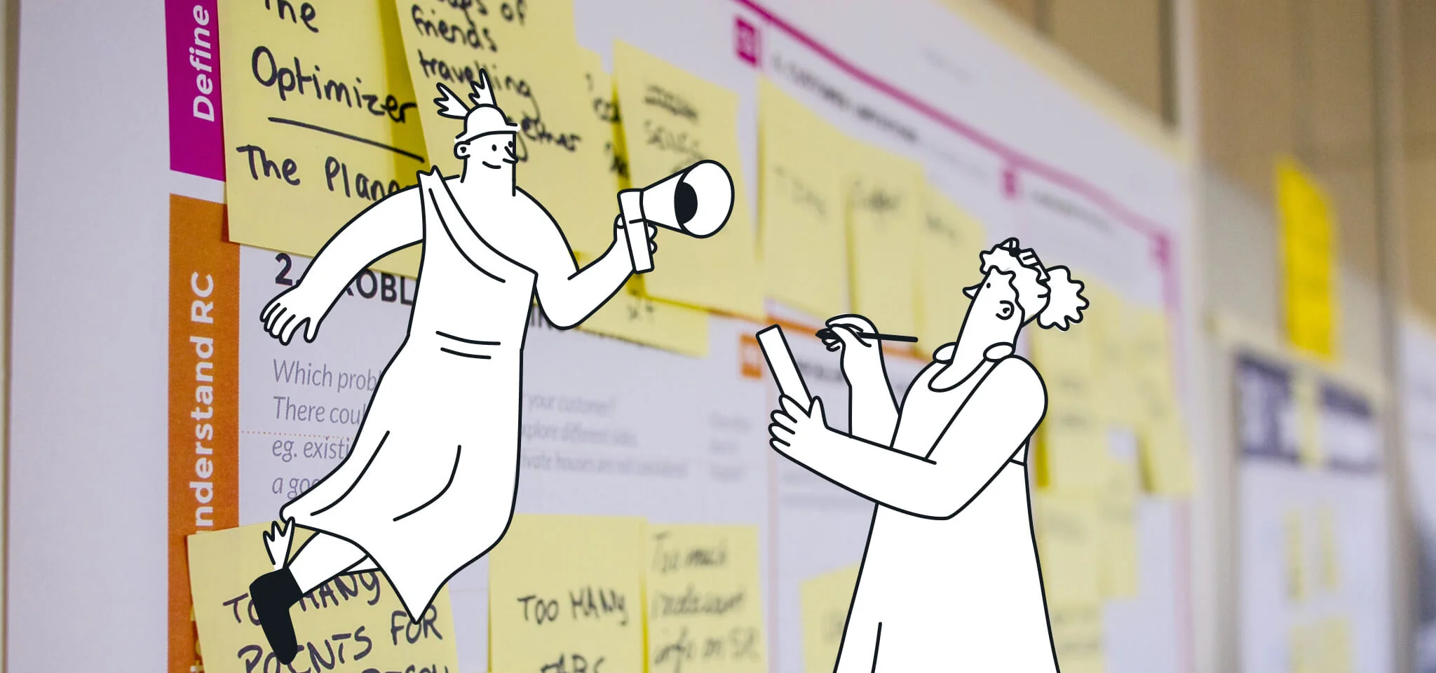
Designing a newsletter without planning could result in a vanity art project that perhaps the patrons of an art gallery would admire, but your subscribers will be left scratching their heads. It’s easy to get lost in what we would like to see in a newsletter, but once you look at the needs of your company and audience, everything becomes a little clearer.
Identify your marketing KPIs
In this economy, every marketing effort is going to be scrutinized for its contribution to the wider needs of the organization. So, dust off your marketing strategy and make a list of ways your newsletter can support your wider marketing goals.
For most companies, revenue growth is going to be a priority. Luckily, newsletters are a great way to nurture customers and move them down the sales funnel toward a purchase.
Email service providers (ESPs) like Mailjet are choc full of email marketing metrics to track the effectiveness of your design. These stats will ensure your newsletter is performing in line with broader marketing goals.
Understand your audience
Before you start splashing colors and imagery onto your newsletter template, you need to understand your audience. Flashy colors and funny memes may appeal to some readers but may not be so palatable to others.
Are you targeting a specific demographic or are your readers diversified? Age, location, gender, industry – there are a lot of data points that can paint a picture.
A customer (or buyer) persona is a sales and marketing tool used to understand and visualize a fictional character to represent your audience. Have this caricature handy when making decisions by asking, “is this right for my audience?”
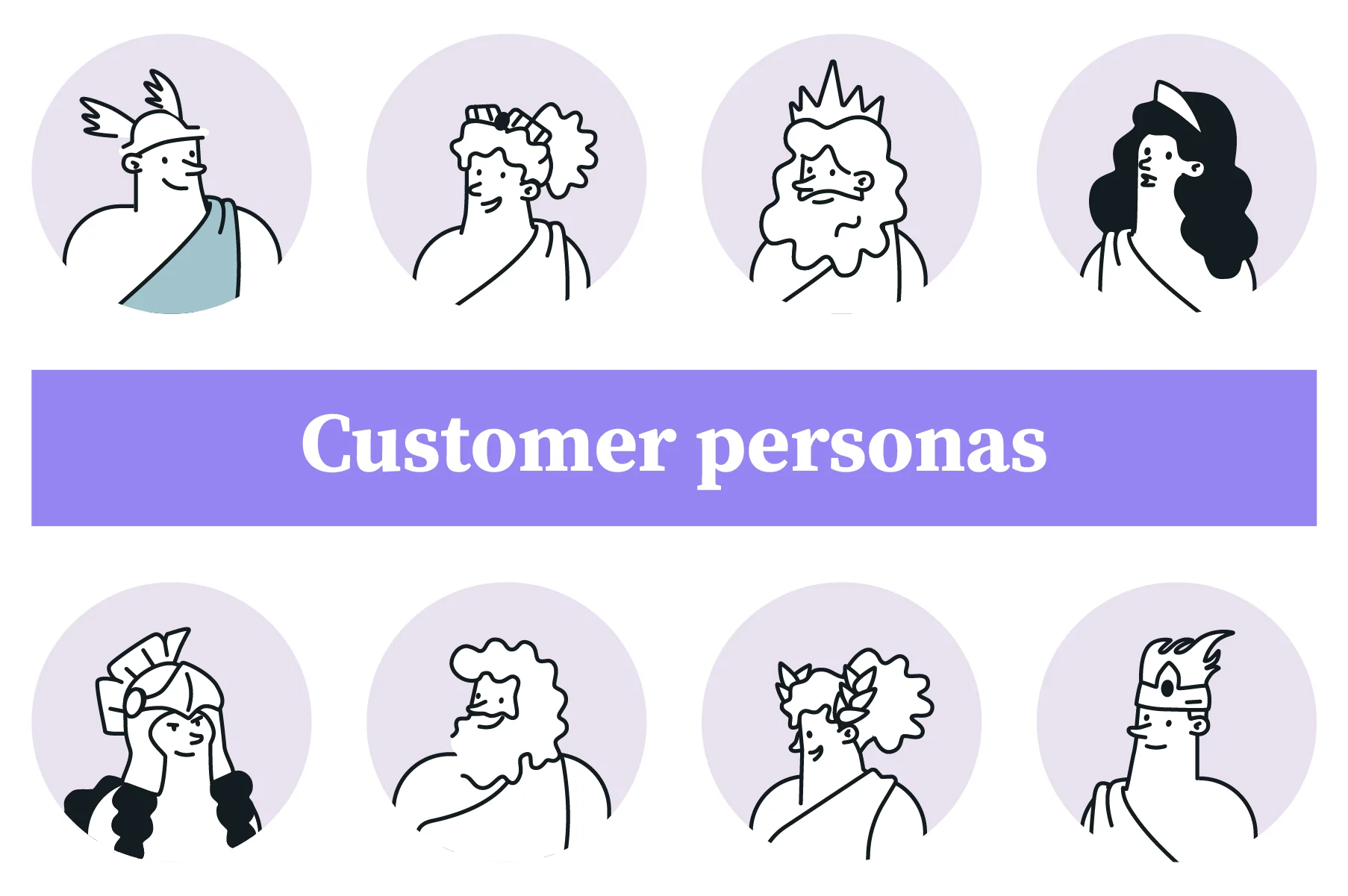
- Your personas can either be represented as stock photos or cartoons like Mailjet’s Greek gods
Look for inspiration
Pablo Picasso once said, “good artists borrow, great artists steal.” And if Picasso himself said so, who are we to disagree? What we’ve noticed over the years as newsletter design has evolved is a refinement of design principles. The email community is, after all, a collaborative place where ideas are shared.
Here at Mailjet, we love curating our favorite newsletter designs:
- 50 newsletter ideas to create engaging emails
- Designing the perfect newsletter for marketing
- 6 great newsletter examples with actionable insights
As well as looking outwards for inspiration, try looking inwards at particularly successful past email campaigns and take notes. We bet you have some great ones – hit us up on social media if you want to share a campaign you’re particularly proud of!
2. Gather your content
Designing a newsletter is a lot easier if you have a logical workflow. It’s inefficient to stop everything you’re doing to find or request a logo or image from a teammate. Make sure you take some time to gather everything you need in advance for smooth sailing down the line.
Utilize your brand kit
The moment a reader opens your newsletter, they need to recognize your brand immediately or they’re going to hit the unsubscribe button, or worse, be classed as spam. The challenge with inboxes being inundated with unsolicited email is that it breeds tough scrutiny.
To develop immediate trust with your readers, you need all your branding elements immediately visible upon opening. This includes logos, colors, and typography. All of these instill a sense of familiarity that match the experience across website, app, or other marketing collateral.
|
Branding |
Specification |
|---|---|
|
Logos |
|
|
Colors |
|
|
Typography |
|
Pick the right content
Remember, subscribers stay subscribed due to the value they find in your newsletters. Having a content marketing strategy in motion is the foundation for any successful newsletter.
Newsletter content can include:
- Articles
- Reports
- Press releases
- Videos
- Webinars
- Podcasts
- Case studies
- Quotes
Every department in your company will likely have something worth sharing. Talk to key stakeholders, content marketers, and product managers to gather and prioritize the material featured.
Content calendars are a great way to plan and keep track of content so you can relax knowing you’re not going to suddenly run dry. Our marketing calendar contains key dates all year round like Halloween and Valentine’s Day that you can theme your newsletter around.
Select powerful images
There’s nothing more eye-catching than a leading image in a newsletter. This above-the-fold real estate is where visual elements really shine. A great example is Really Good Emails’ newsletter, which always leads with a humorous GIF every week – we eagerly open their emails just for the memes!
But there can be too much of a good thing. Images tend to bulk out an email’s overall file size and ISPs can mark them as spam if the text-to-image ratio leans too heavily toward the latter. It’s worth keeping in mind that we are talking about the perception an inbox provider filter has, not about someone looking at and judging the email. Therefore, we recommend a 70:30 ratio of 70% non-images (text, white space, buttons, CSS) to 30% images.

- Inbox providers are known to send image-heavy emails (left) to the spam folder
If you don’t fancy splashing out for Adobe’s somewhat technical graphic design software, some email service providers (ESP) like Mailjet offer image editing capabilities. Or, if you really wish to unleash the artist within you, Canva offers easy-to-use and free design tools, perfect for small businesses.
3. Define a structure
Newspapers follow a very deliberate structure with the most important news first, sports at the back, and fluff in the middle. Adopt an informational hierarchy in your newsletter to give readers familiarity and support your business goals.
Choose a newsletter template
Designing a newsletter without a template is like baking a cake without a recipe – it requires trial and error and could take a lot of time. That’s why most marketers choose a pre-designed email newsletter template.
Templates are not meant to represent the final product, but they do make a good foundation to build on. You can customize a template by adding or removing sections to match the type of content you are offering.
There are many HTML newsletter templates available around the web – alternatively, Mailjet offers a library to choose from and customize in-app.
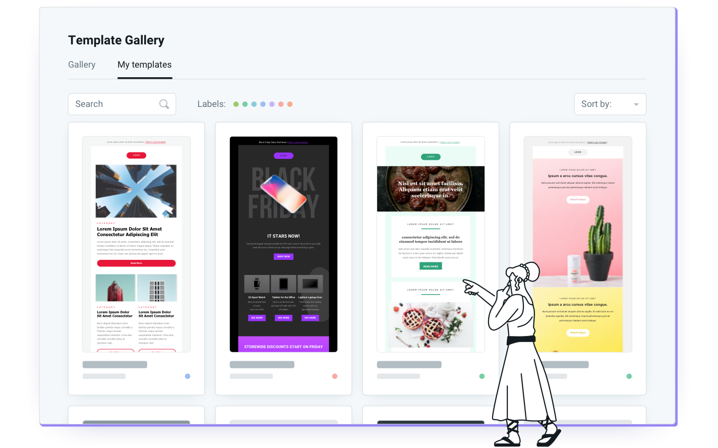
- Mailjet has newsletter templates for every occasion
Go for a minimal layout
Modern attention spans are getting shorter, so time really is of the essence. You’ll lose most readers’ attention if your newsletters have multiple three-column sections. A wall of text and images is going to be met by momentary sighs, followed by a back-click retreat.
We recommended you keep things simple and responsive with a single-column layout. This minimalist design is inherently responsive on mobile devices and keeps the reader’s attention focused on key messages.
Use plenty of white space
In design, less is more…except when it comes to white space. White space is any space not occupied by objects like text, images, and buttons. This includes a blank background, the space between sections, and any other unoccupied space.
We’re used to focusing on the images and text of an email, but let’s not forget that objects can only be seen when there’s white space in between. They say you can never have too much space because, in an age of information overload, white space gives the mind a break.
White space makes newsletters more visually appealing and helps the user process information better. In fact, we can actually guide the eyes down a visual “yellow brick road” by creating more white space around each object or text.
4. Mix your design elements
Finally, we get to drag-and-drop everything into place and create our newsletter. Before you go all gung-ho with the design, pay attention to these three fundamentals to make your good newsletter great.
Pick a color scheme
Colors are often called the emotion of design. While it may be tempting to use bright colors to catch eyeballs or elicit reactions, you don’t want to deviate from your brand color palette from step two.
If you plan on including large images, then it’s wise to keep colors subtle – too many conflicting colors may hinder disabled readers. You don’t need to be Vincent van Gogh – most newsletters use color sparingly. It’s common to see white backgrounds with brushes of color in the header, footer, or dividers.
Calls to action (CTAs) are most effective when they contrast your primary color. For example, if your brand color is a shade of blue, orange CTAs buttons will stand out on the page. CTA buttons are the only design element you want to stand out in the design.
Draft your copy
A company newsletter is like a diving board to get customers from their inboxes to your website. Your copy needs to grab the attention of readers like a hook, be brief enough to not give too much away, and inspire curiosity in the reader to click through. Sound easy enough?
Font size weaves into the effectiveness of good copy. Our general rule of thumb is to keep body text between 16-18px, and section titles should be no less than 26px. Unlike website copy, we advise against linking text as too many links will divert attention, won’t stand out enough, and are hard to click on. Save any links for your call-to-action, which is continently next on our list.
Craft strong call-to-actions
The positioning of CTAs directly impacts the all-important click-through rate marketers are constantly striving to improve. It makes sense that scattering your newsletter with plenty of CTAs will give readers more options, and more options equals more clicks, right? Not exactly.
The ethos of great design always boils down to less is more. And the same couldn’t be truer for CTAs. Too many links lead to analysis paralysis and, therefore, lower overall engagement.
But what if you have lots of new content to share? In this case, you need to curate content based on strategic goals and value to the reader, and maybe move to more frequent newsletters. For example, Mailjet subscribers are delivered a light newsletter every week with just two of our leading stories.
- Mailjet’s newsletter serves up our best content every week
It often happens that you get so close to a newsletter, you can miss the bigger things. Step five is all about zooming out and ensuring your newsletter displays well on all devices, inboxes, and accessibility readers.
Check your design is responsive
As we design our newsletters on wide screens, it’s easy to forget that 65% of your audience opens emails on smartphones first. A newsletter’s responsiveness is measured by its ability to scale to different screen sizes.
Did you notice? Many of the tips we’ve shared here today all contribute towards responsive design: single-column layout, font size, fewer CTAs, optimization of images, etc. Now it’s time to put them to the test.
Once you’ve finalized a design, you can preview the design in a simulated phone and desktop view within your email service provider. It doesn’t give you the real-time accuracy of email testing (below), but it’s a good overall indicator of the design.
Leverage email testing tools
Now we’re happy with the design, we need to see how it will realistically render on devices when we hit the big send button.
One way of doing this yourself is by sending a test email to your Gmail account, seeing as this is the most popular email client. Outlook would be the next best test choice, especially if you operate in B2B. Alternatively, Mailjet’s Email Preview tool can test send to a multiplicity of operating systems and email clients without leaving the app.
Another test you’ll want to conduct before sending is an inbox placement test. Tools like Mailgun Optimize’s Inbox Placement allow you to check what inbox your emails will land in and fix potential spam foldering issues before your newsletter gets sent.
Conduct accessibility tests
350M people worldwide have moderate to severe visual impairment, so it’s important to design your newsletters accordingly.
And there’s lots to consider: copy, alt-text, color contrast, and typography to name a few. Screen readers are just one of many tools used by disabled users when interacting with your newsletters.
There are a whole host of accessibility testing tools out there to ensure your messages are fully appreciated by everyone. Or you can streamline the process with Email on Acid’s Campaign Precheck and check your newsletter against important accessibility standards, optimize code automatically, and click to fix other suggestions.
6. Send your email
If you followed every step so far, it shouldn’t be too scary hitting the send button. From a design perspective, the biggest part of our journey is over, but there’s always room for improvement. A true artist is never satisfied!
Track your metrics
There is a treasure trove of campaign analytics locked inside your email service provider’s stats dashboard. But none is better for a designer than a click/heat map. This map visually shows which calls-to-action (CTAs) readers clicked throughout your newsletter. It’s a tool that designers can use to understand the audience’s preferences.
But how do we know if they clicked based on content, design, or both? By tracking click-maps over multiple newsletters, we can determine if certain positioning consistently receives more or less clicks, even as the content changes.
For example, if your heat map is consistently looking a little cool at the bottom of your campaigns, we’ll know our audience has an appetite for shorter, punchier emails.
Iterate to optimize
Iteration is a great process for newsletter design because it protects what works, keeps everything consistent for readers, and seeks opportunities to optimize. By analyzing your best and worst performing CTAs, you can create new design ideas and A/B test them with a smaller sample of subscribers.
So, there you have it – the definitive list of steps to baking your very own newsletter. Make sure to download, print, and pin up our infographic to have all the steps handy for your newsletter project.
Baking a cake is easier when you have the right tools for the job. Mailjet is equipped with all the utensils you need to intuitively design a professional newsletter. Our best-in-class Email Editor comes packed with a seamless drag-and-drop tool to whisk all your content elements together.
The icing on the cake is Real Time Collaboration, for teams or agencies to work together seamlessly with comments and user permissions. Order up!