Marketing
How to integrate landing pages with your email marketing campaigns (and why)
Crafting compelling email content is crucial for all senders. But what happens after a subscriber clicks that enticing call to action (CTA) you’ve rounded out the copy with? Where are you sending them to? And why? A well-thought out and connected lead capture landing page can be the difference between a casual visit and a valuable conversion, turning clicks into leads and ultimately, customers.
In this post, we’ll look at why you should be driving synergy between your landing pages and email marketing campaigns, some of the benefits and finally, provide you with actionable steps to create your own cohesive campaign experiences.
The power of cohesion
In the world of digital marketing, consistency is key. Customers now expect a seamless, smooth, and hassle-free experience across all channels when communicating with your brand. This is why an omnichannel marketing strategy that harmoniously connects those channels together is now so important.
But what does this mean specifically for email marketers? Well, in many cases, the customer journey begins the very moment that first email lands in their inbox, meaning you are the one that sets the tone from the off.
Now, while your email campaigns may be on point, and the content highly relevant and targeted to your audience, is that experience mirrored when a subscriber clicks on a CTA and arrives at a landing page? If not, and they arrive at your landing page and see something else – like a different page title, product offering, or design scheme – it’s likely they will bounce or worse, unsubscribe from your email list. Not the goal we are after.
This is why you need to create a cohesive experience for subscribers. Whether you want people to sign up for a webinar, download a lead magnet, buy a product, or take any other action, you need to make it easy and compelling for them to do so. You need to create a clear and consistent path from your email to your landing page, and use persuasive copy, design, and CTA to motivate them to act.
Easy, right? Well, it can be when you know how.

Julia Ritter and Natalie Lynch of Sinch Mailjet shared insights on maintaining consistent branding across all customer touchpoints in their recent Email Camp 2024 session, Uniting your signup forms, emails, and landing pages with cohesive branding
How to create a seamless customer experience
So, we’ve established why it’s important to create a cohesive experience between your email marketing campaigns and landing pages, it’s now time to learn how. What are some of the elements you need to work on? What areas need to be aligned to ensure that experience is being delivered to customers?
Let’s take a look.
Crafting consistent messaging
If you’re working within a larger marketing team it’s likely you’ve come across a brand or content style guide. This is essentially a living document that defines your brand’s voice, tone, and style choices so that copywriters across the organization (and externally) communicate consistently when talking about your product.
It’s important to maintain a consistent brand voice because people prefer to interact with brands they know and can easily identify. So, when visitors recognize your brand voice, they feel a sense of familiarity and trust which hopefully, translates to higher engagement and conversion rates on your landing page.
Therefore, before hitting that send button, it’s good practice to thoroughly proofread both the email and landing page content to ensure consistency in voice, tone, and language.
Smooth design experience
Just as it is with copy, it’s a good idea to have a brand style guide that defines your logo usage, color palette, preferred fonts, typography, and design principles. Visitors recognize and trust a brand’s visual identity as much as its verbiage.
So, you’ll want to ensure that both the email and landing page are singing from the same hymn sheet. Your visual elements should have a unified look and feel as well as the layout and structure. For example, if the email has a prominent CTA button, ensure that it’s mirrored on the landing page for consistency.
Matching CTA
While this might seem obvious, a mismatched CTA creates confusion. If the email promises one thing (Download the eBook) and the landing page offers something else (Sign up for a Free Trial), visitors become unsure of what they’re supposed to do next.
I thought I was downloading an eBook, not signing up for a free trial!
That’s why your email and landing page CTA should match in terms of the text, placement, and urgency. It’s also a good idea to follow best practices for CTA copywriting, such as using short, attention-grabbing texts that create a sense of urgency.
When your email CTA and landing page hero echo each other, it sets the stage for a cohesive user experience. It makes sense that if a subscriber has already clicked on your email CTA, and they see that exact same CTA on the landing page, they’ll likely click it, right?
Use a targeted landing page
Think of your emails as a restaurant menu and your landing page as the main course. An email’s job is to whet your subscribers’ appetite, to pique their interest enough to give them a reason to click and find out more.
Now on to the main course. Once subscribers arrive at the landing page they want to know more. But imagine their annoyance when the waiter serves them something different than what they ordered? If the steak ended up being a gluten-free pasta dish.
To avoid this unfortunate culinary experience from happening to your own campaign, create dedicated landing pages to match your email’s offer. While it might be tempting to direct subscribers to a general product page or pricing page, your conversion rates will be a lot higher if the two are synchronized.
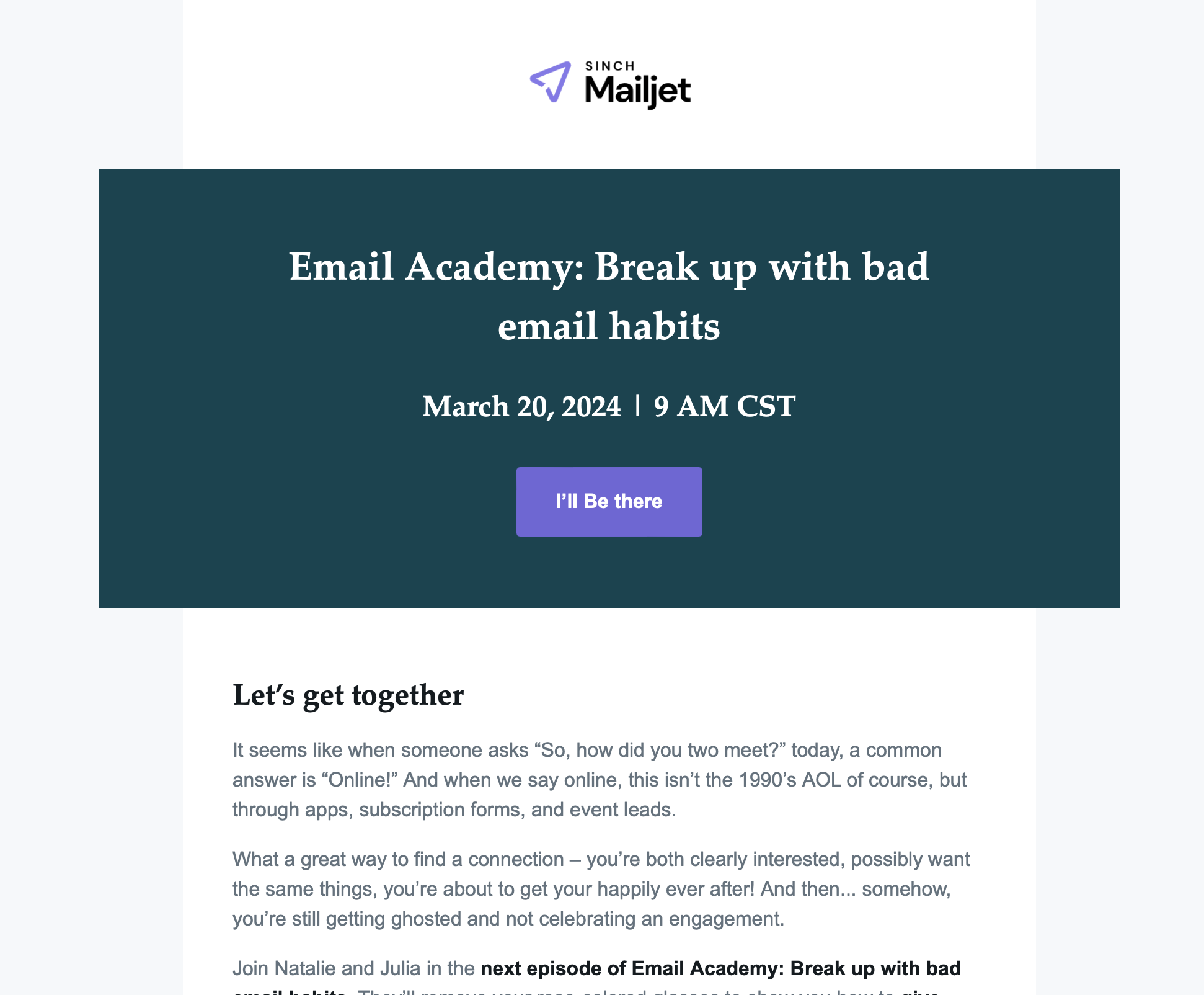
This is an email our subscribers receive informing them of an upcoming episode of our Email Academy webinar series.
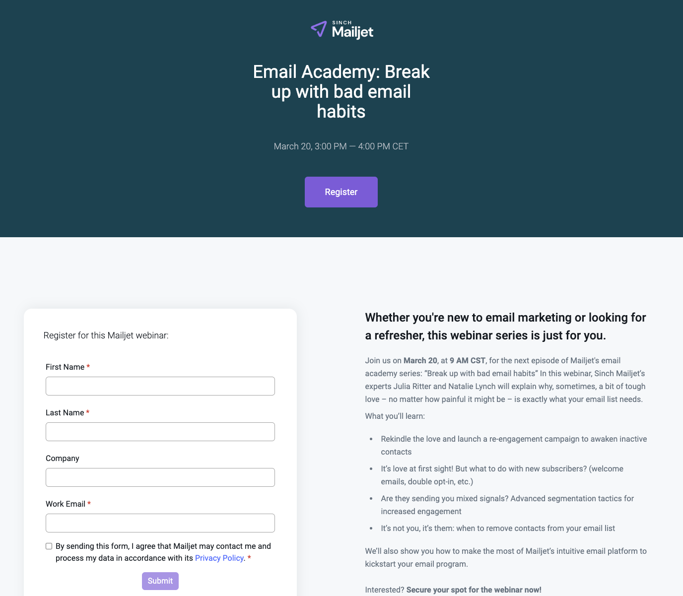
Notice how the landing page is targeted specifically to the webinar, and is synchronized both from a content, design, and structural perspective
Mobile optimization
Research from our 2024 Email Engagement Report shows more than 71% of people check their email on a mobile device. Only around a quarter of consumers say they check their inbox on a computer, whether that’s a desktop application for email or webmail in a browser.

This means that when creating your email marketing campaigns and landing pages a mobile responsive design is very important. Mobile responsive design uses flexible elements that allows content to automatically adjust to different screen sizes and devices.
To this end, it’s generally good practice to avoid complex layouts when it comes to your landing page. Try prioritizing clear CTAs, essential information, and minimal text with ample white space for better readability. It doesn’t mean stepping away from your brand guidelines but looking through them with a more minimalist lens.
All this well help you to improve visitors’ satisfaction, reduce bounce rates, and increase successful conversions.
Always be testing
What was it that British mathematician William Kelvin said?
“What is not defined cannot be measured. What is not measured, cannot be improved. What is not improved, is always degraded.”
While Kelvin may have been talking about 18th century mathematics, he was on to something. If you’re not A/B testing your overall email marketing campaigns and monitoring the performance of your landing pages, how will you be able to measure success?
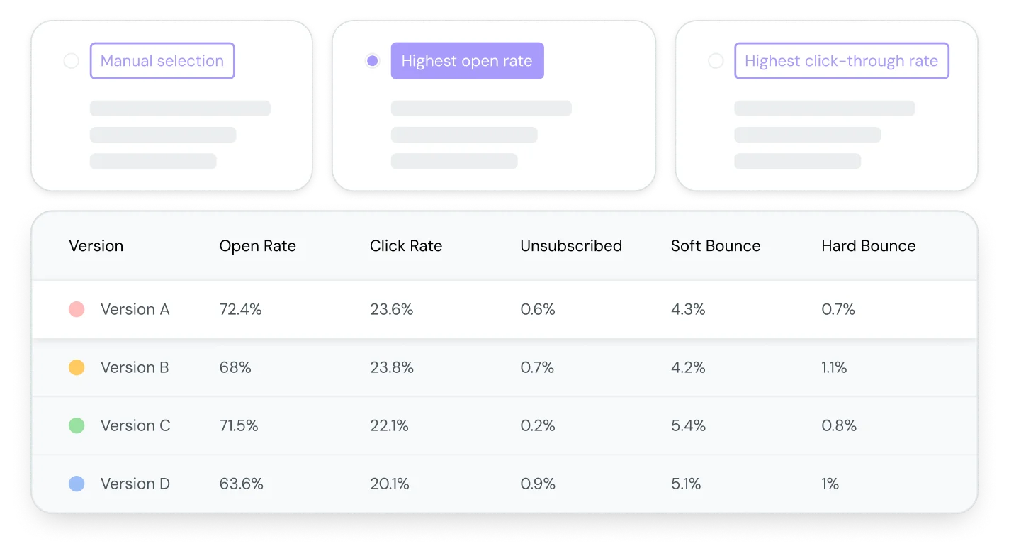
Some of the elements you could consider testing are:
- CTAs: It’s worth testing different email and landing page CTAs. For example, imagine you sell cat toys. You could test a more playful CTA, such as “Make one cat very happy” versus something for traditional and transactional such as “Buy now” can show a significant impact.
- Content: Short, straight-to-the-point content traditionally performs better than long-from content. But don’t take that as gospel. You might find that your audience are avid readers and prefer more information before making a decision.
- Video: Try adding some video content to your email and landing pages. A compelling video thumbnail could significantly boost your email’s CTR, enticing viewers to head on through to the landing page.
- Click-through rate (CTR): Monitor the CTR from your email to your landing page. If there is a huge disparity between that, and the landing page CTR, you might want to add clarity to your messaging and ensure there is synchronization between content, design, and structural elements.
Create landing pages with Sinch Mailjet
So, we’ve established just how important it is to synchronize your email marketing campaigns with your landing pages. When visitors encounter a cohesive brand experience, they feel a sense of familiarity and trust, which often translates to higher engagement and conversion rates.
But how can you achieve such fluidity with your current email marketing strategy?
To simplify this process, Mailjet now offers a drag-and-drop landing page builder built directly within our email marketing platform. With our new tool, you will have access to pre-built templates that are easily optimized to closely align with your email marketing campaigns.
You can seamlessly integrate forms – including custom fields – to collect valuable visitor data as well as sync leads with email lists, allowing for targeted follow-ups and nurturing.