Email best practices
Here’s how flat design makes marketing emails appealing
Simple ways of completing a task make your life easier. Whether it’s a coffee maker that brews a fresh pot or a car door that opens without a key, ease of use goes a long way toward efficiently helping you through the day.
More and more these days, the same applies to email design. Recently, there’s been a move away from complex 3D visuals in email design, with simpler versions gaining favor. Rather than relying on flashy graphics or complicated layouts, straightforward and readable media conveys what you need to see without wasting your time.
In short, less is more!
Let’s look closely at flat design trends and why they make a big difference in email marketing, where you only have a brief moment to capture the recipient’s attention.
What is flat design?
Think about it, when learning more about a product or service, your eye naturally looks for the most concrete information. While complex 3D graphics can be aesthetically pleasing, they don’t always help you understand why a particular company has what you need. Enter flat design.
Flat design is a minimalist graphic design trend aiming to improve usability by implementing 2D shapes, flat icons, and other basic elements. That way, users can still view clean graphics or typography on a website or email without getting bogged down while seeking more info. A flat user interface (UI) design increases responsiveness on various devices and screen sizes.
Typically, several elements comprise a flat design. Bright colors help convey a theme, enhancing simple 2D shapes. Because of its minimal nature, flat design discards features like gradients and drop shadows. To increase readability and load times, simple fonts replace more dramatic ones. And 2D vector artwork replaces intricate visual elements for increased clarity.
It all comes down to improving usability and conveying information clearly, enabling users to find what they need. Also, since flat design is highly responsive, anyone can read your marketing newsletters, no matter the device.
Flat design vs. skeuomorphism
Think back to the look of the very first iOS Notes app. It was a leather-bound notebook with lined yellow paper. Resemblant of the real thing, it eased us into transitioning from pen and paper to touchscreen notes. That’s skeuomorphism. Now, compare it to today’s version, which is simply a white canvas!
The simplicity of the flat design is the product of a natural evolution in user experience (UX). As the consumer market becomes more familiar with technology (in this case, email), there’s less need for visual aids to bridge “action A” to “action B.” A recent study says that in the United States alone, individuals spend an average of over 10 hours a day on electronic media. To give some perspective, most people are awake 16–18 hours daily.
Flat design embraces the screen’s limits rather than embellishing them, like its predecessor, skeuomorphism, which resembles a real-life object. Compared to flat design, skeuomorphism is layered with details and takes up more screen space. Flat design’s minimal approach leads to shorter loading times and more room for you to get creative.
While a skeuomorphic design may provide the most significant level of visual detail and impress users with its various graphical elements, usability may decrease. Users could get lost among an array of intricate graphics or be unsure of what steps they need to take to seek more information.
In contrast, emails with a minimalist flat design have an understandable user interface that encourages interaction in a straightforward, no-frills fashion. Flat design still uses pleasing graphics, but it does so more fundamentally, relying on colors to direct attention and simplicity to increase usability.
Also, as flat design promotes responsiveness, users can view your messages on any device, helping drive new subscribers, brand awareness, and website visits.
Flat design also offers the benefit of making an email designers’ jobs easier. Designers can save time without the need to create elaborate 3D graphics or search for fancy typography.
Benefits of flat design
When designing marketing emails, you can effectively apply flat design to enhance usability and guide readers toward essential information. With so many positives, including flat design in your emails is a no brainer.
Here are some of the benefits of using flat design in newsletter emails:
- More readability and legibility: More than anything, you want your audience to read pertinent information, which will enable them to understand why your brand is better than your competitors and find your website. As flat design can enhance readability, you can rely on basic typography to express your message clearly without being fancy or flashy.
- Easier to understand: Flat design provides a visual appeal to your emails through its use of simplified graphics instead of intricate 3D shapes. Since simple shapes load faster, users can see your marketing materials without having to wait.
- Better engagement: With its easy-to-decipher layout and straightforward communication, flat design can boost user engagement, driving more subscribers, and website visits. Flat design provides users the information they need and directs them to your website, where they can receive in-depth knowledge about your products and services, along with their benefits.
- More responsive experience: Remember, because a flat design works within the constraints of a screen, it makes for a more responsive email experience. Major brands follow today’s widely used one-column email template. The clear hierarchy of the blocks makes it easier to scale an email across various sized screens. Scrapping cumbersome patterns and textures also saves designers time, and they no longer have to worry about elements that load slower on a cell phone or a tablet.
Four examples of flat design in emails
Flat design also comes out of the realization that content is king. Cutting through the inbox in a noisy digital world isn’t always easy. Removing flashier design elements allows the reader to find value right away.
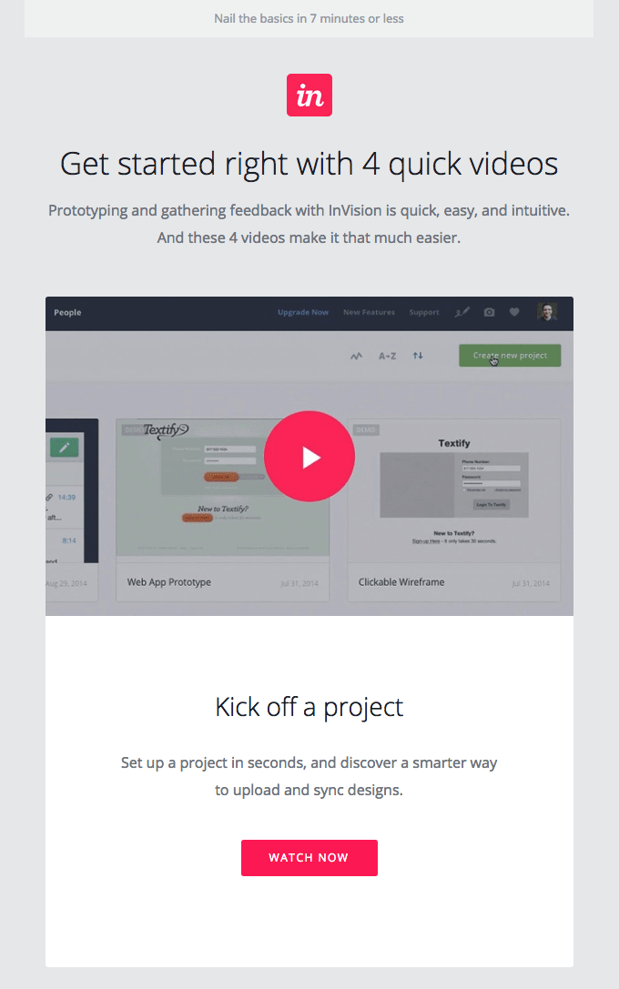
1. InVision
This welcome message from InVision is an ideal example of flat design. Four introductory videos sit front and center, with vivid pink sprinkled throughout as calls-to-action (CTA). This gentle guide is an inviting method for a new user to learn more about the brand and seek out their products. While nothing is particularly flashy about the layout, it expresses pertinent information informing the user of the next steps.
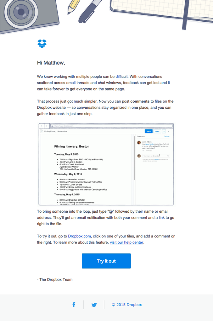
2. Dropbox
This email from Dropbox shows how you can enhance a text-focused email with minimal images. The email’s layout implements “negative space” – the white area the camera and stationery don’t cover – to add balance and highlight the personalized message.
Notice how the negative space emphasizes the black text, adding focus and importance to the message. In fact, instead of trying to sell something to the reader, it seeks to inform them of the benefits they’re missing out on that Dropbox can provide. Overall, the email is easy to decipher and minimizes the use of complex graphical elements.
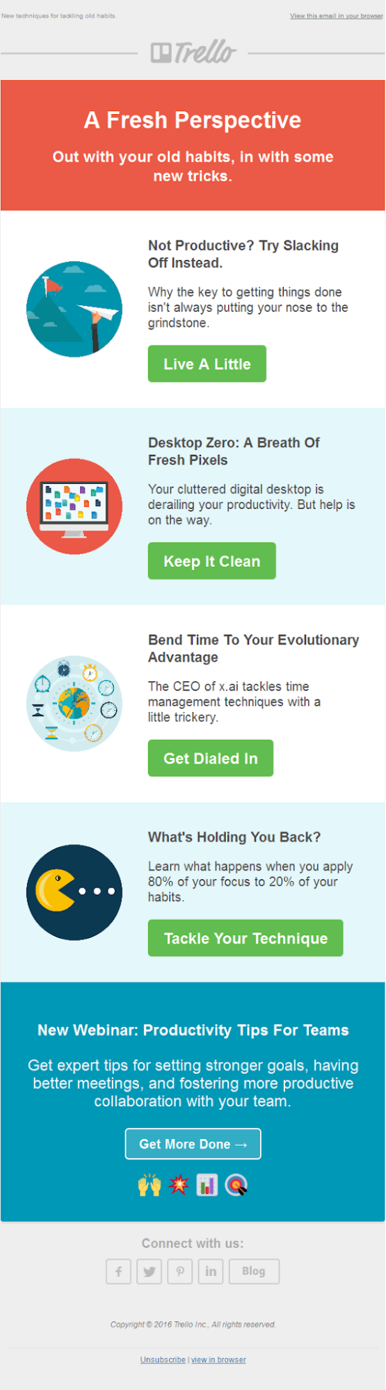
3. Trello
This example from Trello uses a nice mix of color, simple graphics, and readable text to clearly convey its message. The vivid green highlights the CTA, and the alternating blocks of blue and white give it a fresh appearance.
Each block contains new information, guiding the reader step-by-step through everything Trello offers. The contrast between the text and background makes the message clear, and readers can quickly scan through it from top to bottom and view pertinent information.
4. Fitbit
Fitbit implements simple 2D graphics, various contrasting colors, and an uplifting message to create a refreshing, fun marketing email. It positions the CTA in the middle, giving users an easy redirect to the website. The cheery colors accompany the fitness theme, inviting users to experience what Fitbit offers. Overall, the email gets right to the point without overloading users with complex 3D images or elaborate text.

The bottom line
Flat design is an ideal solution because it allows your audience to experience an understandable user interface, pleasing colors, readable text, and simplified graphics. Flat design emails are aesthetically pleasing and don’t feature complex 3D graphics or extravagant fonts. Also, as flat design is highly accessible, recipients can read your marketing emails on any device, ensuring your message reaches the masses.
Not only is it ideal for your audience, but your design team won’t need to spend hours designing intricate graphics or selecting elaborate fonts like in a skeuomorphic design. Instead, they can concentrate on improving UX with flat design principles like minimalism, bright colors, basic fonts, and 2D shapes without fancy textures.