Email best practices
7 email design tips and ideas to follow

When you want to grow your brand, email marketing is one of the most effective ways to do so. Not only do does it give you a platform to promote your products and services, but it does so more effectively than any other channel out there. On average, you’ll see $41 for every dollar you invest into your customer outreach (4100%). Email marketing ROI is not something to be taken lightly.
For your email marketing strategy to provide the results you’re after, great email design plays a central role. That means aside from the information you’re trying to convey, other integral elements make an impact such as interactive features, font choices, readability, and more.
But what makes for a good email design? Here’s our guide to designing marketing emails, with seven valuable email design tips to make yours more compelling.
Why is email design important?
When you use email marketing to promote your brand, not only do you want your target audience to open and read the entire message but also to act.
And convincing them to do so requires more than simply relaying facts, figures, and other information about your products and services. No matter how good those may be, an effective email newsletter design can push them to further discover what your company has to offer.
Email design considers every element of your email newsletter, including colors, eye-catching images, content, and subject lines. Finding the ideal mixture of these features can increase visual appeal, clarity of your message, and click-through rates.
Let’s look at some ideas and tips to improve your email design for a successful email marketing campaign.
Seven email design tips to follow
Tip #1: Focus on your CTA
First and foremost, the purpose of a marketing email is to drive website visits and increase sales. To do that, you’ll need enticing calls-to-action (CTAs) that convince recipients your company has what they need.
CTAs are graphic elements designed to persuade your audience to take action by seeking out more information, making a purchase, or subscribing to your newsletter.
Studies show that CTAs placed at the bottom of the email ramp up higher click rates than on the right or left of the email. You also want to go for an easy-to read and large font that also looks good on mobile devices like a tablet or phone.
Ease of reading and navigation are critical to your email designs. That means the recipient should be able to look through essential info quickly, without much scrolling.
The email format should be 600 pixels wide or less and not require side-to-side scrolling because it makes it harder to read everything and it’s time-consuming.
And research into eye-tracking demonstrates that in languages like English, where you read from left to right, people pay closer attention to info along the left-hand side of a screen, so including vivid images on the left focuses their view and leads them to essential facts about your brand.
Tip #3: Use clear typography
While it may seem natural to use your favorite font, you can achieve better results with regular, powerful ones that are easily read. If you can’t decide on a font, stick to the traditional options like Arial or Helvetica.
If the images in your email aren’t especially interesting, oversized fonts can emphasize your central message or title.
Keep in mind that your emails are part of your brand communication, so your font should support brand consistency.
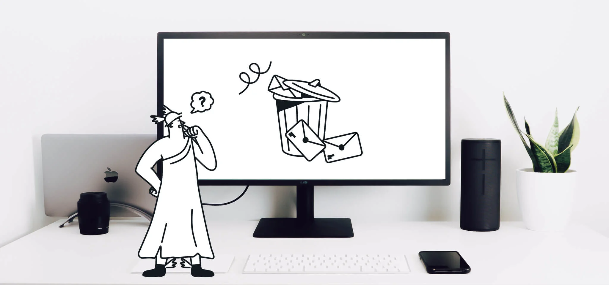
Tip #4: Avoid background images
More than anything, it’s vital that your recipients can read what you send them. But when you include background images, they may only see a blank screen when they open your message.
The reader may only see a blank screen when you use background images because some email clients block images automatically.
If your audience can’t see your marketing materials, they’ll likely move them to the trash, or they could end up in the spam folder. Instead of using background images, we recommend color blocks to highlight essential info.
Tip #5: Think of email design like web design
Like a sales pitch, you have a limited amount of time to convince your readers once they open your email. Design your emails in a way that cuts to the point, without any needless graphics that slow the delivery.
Minimalist design concepts maximize your output. Make good use of available space, with no more than three columns, and include menus if you have several products or services to describe. Still, the goal remains to direct your audience to an optimized landing page to convert.
Tip #6: Incorporate brand identity
While your brand’s specific products and services are a significant selling point, so is your brand identity. By expressing the personality and values of your brand, your audience gains trust with it over time.
Communicating your brand identity can involve unique logos and typefaces, colors, slogans, or even the signature of the CEO. Be consistent with your design elements so readers will recognize your aesthetic when they click on your email.
Tip #7: Make it interactive
Micro-interactions are a popular trend in website design and incorporating them into your email newsletter design enhances your reader’s experience.
Interactive features engage your audience, leading to increased conversion rates and brand awareness. An email with a built-in microsite captures a recipient’s attention, intrigues them, and could entice them to learn more about your company.
Even if you don’t design a fully-interactive email newsletter, sprinkling your design with interactive elements can make for more effective communication with your customer. These can include hotspots, CSS animations, and switchers that change the design.
Easily add these features to your design and provide your audience with enticing, exciting, beautiful emails.
Get inspired with these email design ideas
To give you some ideas for great email design, we’ve collected a few examples from various brands.
Craft
This email from Craft, for instance, features a vivid color scheme and a succinct message that draws readers in and captures attention. The appealing look reflects the brand’s colors on the website for a cohesive transition from email to landing page.
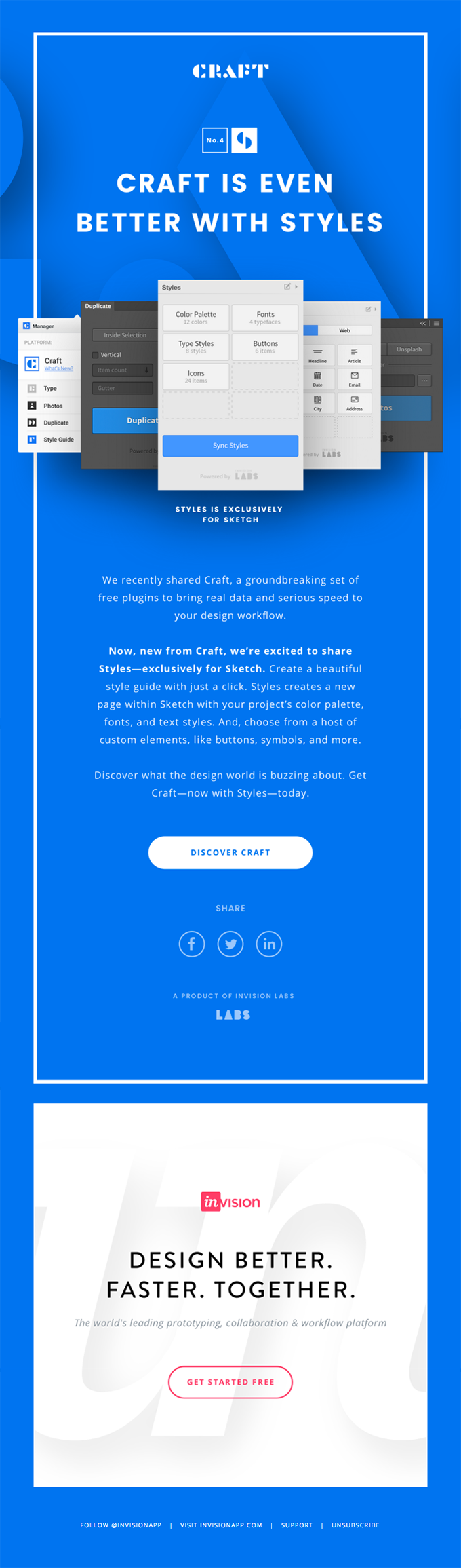
Craft combines vivid colors with a cohesive UX.
Uber
Another example for engaging imagery is this email from Uber. The graphs and data are easy to follow and the simple, straightforward copywriting makes it appealing to book a ride along the Shore.
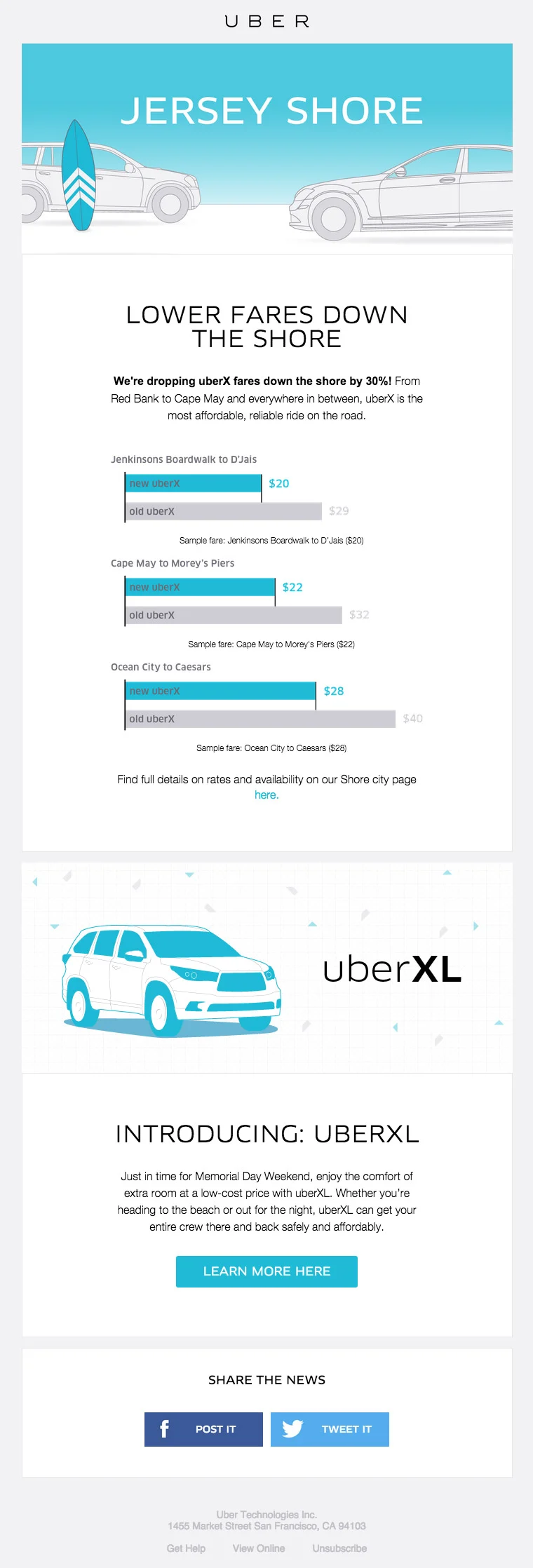
Graphs make for an eye-catching element in your email designs.
Shwood and Stanley
Speaking of appealing… first-rate visual elements can cause recipients to stick around and read what you have to say. The high-end eyewear company Shwood x Stanley does just that in this email that uses striking imagery and an enticing call-to-action.
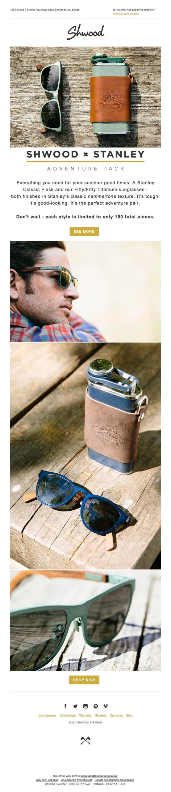
Shwood and Stanley demonstrating how to effectively combine striking imagery with copy
Grubhub
Another way to add catchy elements to your email design is to integrate GIFs. Grub Hub’s email below does just that, with an animated GIF that grab’s the recipient’s attention and directs them to pertinent information. Combined with a conversational tone of voice, GrubHub speaks to its audience like a friend, rather than sounding pushy. This tone makes for a lighthearted email that makes you want to click through and learn more.
GIFs add an element of fun to your email design.
Starbucks
If your email has a lot of information, you can help structure it by using a clean design like in this example from Starbucks. The coffeehouse chain covers a lot of information in a visually pleasing, to-the-point manner.
They use clear, high-quality images paired with brief descriptions that convey pertinent info. And horizontal divides separate each subject, so the reader knows where one ends and the other begins, offering an optimal user experience.
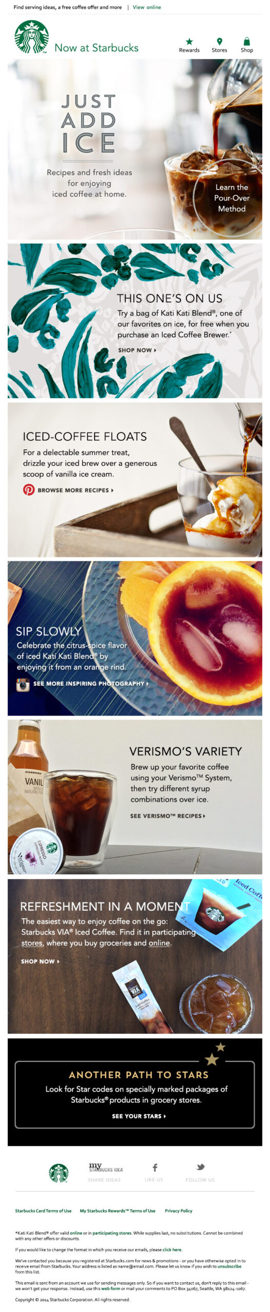
Use a clean design to convey a lot of information.
Collaborative Fund
Want to go bold with your design? Then check out Collaborative Fund’s email which uses strong splashes of red and yellow throughout, increasing the impact of its message. Red is known for expressing passion or power, while yellow looks energizing and vivid. Typically, brands use color at the beginning of their emails, but Collaborative Fund took it further here, enhancing the visual effect and making a more powerful impression.
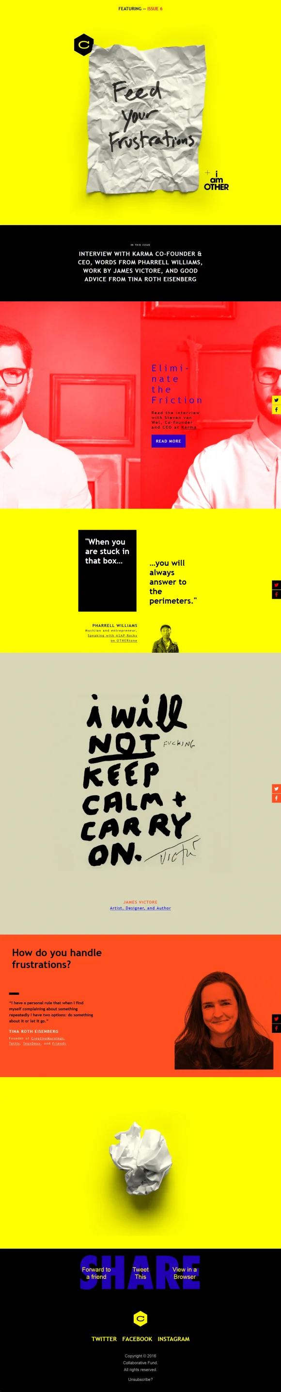
Strong color blocks enhance bold messaging.
Need more email design tips and ideas? Consider an email editor with ready-to-go templates
Creating emails takes time and energy. But using an email editor simplifies the process tenfold, allowing you to pay attention to other essential responsibilities.
Here are some of the benefits of using an email editor.
- Time-efficient: Many email builders use simple, intuitive interfaces like drag-and-drop editors, so you can quickly create the design you envision.
- Replicability: When your email newsletter template produces excellent results, you can use it again, knowing it’s a quality design ahead of time.
- Analytics: Email template builders typically feature built-in analytics, allowing you to monitor how your emails perform and how you can refine them for even better results.
- Vast template library: As you design more and more email templates, you’ll have a wide selection to choose from, letting you select one quickly
***
This is an updated version of the blog post “5 simple ideas to improve your email design” published on the Sinch Mailjet blog in 2014.