Email best practices
Gmail finally embraces responsive email design

If we were to ask email developers what would be the one thing they’d change about their job, we’re sure many would say “Gmail”. Google Mail’s restrictive requirements when it comes to coding responsive emails have been a time-sucking nightmare for years. But that could be about to change.
Last week, Gmail announced they’ll be making an important update that will change the way the email client deals with code. What does this mean? It means developers’ love-hate relationship with Gmail might soon turning into a love-love relationship.
So, what is the problem with Gmail, anyway?
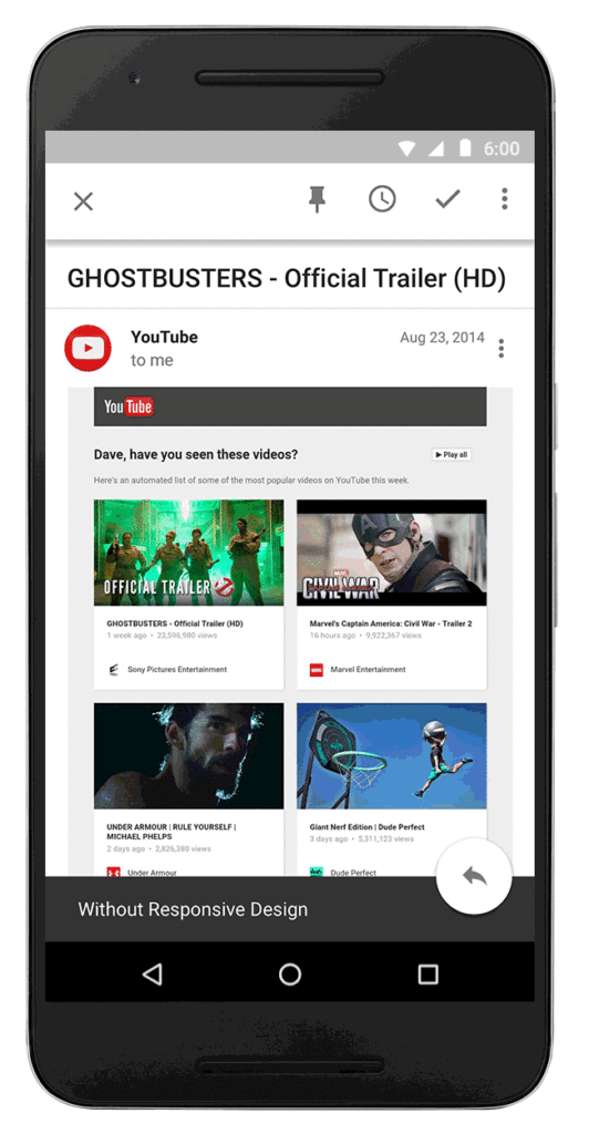
Back in the day, people would access their emails on their desktop computers, with nice, big screens. Nowadays, people access their emails from a range of devices, all of which have multiple screen sizes: mobile, tablets, desktop, wearables… Responsiveness is now key. Designs now need to be easily readable across different platforms, adding yet another challenge to the developer’s work.
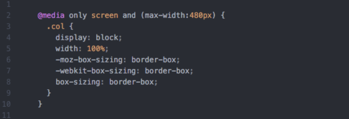
When it comes to the structure of your email, the easiest way to target different devices to achieve responsiveness is by using media queries. Basically, media queries are a way to alter the elements in your design, mainly depending on the screen size the message is read on. However, media queries are not yet supported by Gmail, which means that ensuring your designs rendered properly on all of these devices is a real pain.
But Gmail’s restrictions are not limited to media queries. While with other webmail providers it just takes a few lines of code to add embedded styles at the top of your HTML file to ensure your message is consistently formatted the way you want across all email clients and devices, this is not an option with Gmail.
In its attempts to protect users against security threats, Google’s email solution strips out most of what’s in the tags, including that embedded style. This ultimately means that developers need to specify the formatting of every tag they want to style by using the always-reliable-but-incredibly-time-consuming inline styles. A workaround for this is to rely on the aria-labelledby hack to target elements that you can’t address with the classic “class” and “id” attributes, like our open source markup language MJML does.
OK, that’s not good. So, how will this update change things?
Well, for starters, Gmail has announced they will start supporting media queries, which will significantly ease the pain of coding responsive emails that look beautiful on every device. Now, stacking different blocks in your multi-column designs or targeting different screen sizes will be way simpler.
And that’s not all. Gmail has also announced that they will start supporting embedded styles, including classes and IDs, which were previously stripped. By doing so, Gmail gives developers the opportunity to finally move away from the inline styles. This is a huge improvement and will have a massive impact on the time spent coding an email. Combined with media queries, this is significant step forward in the battle to conquer responsiveness across all devices.
What this means, overall, is that there won’t be a need to use the aria-labelledby hack anymore.
Amazing! What will this mean to me, then?
Basically, it means Gmail won’t be the main cause of your coding problems anymore (at least for a while). Thanks to embedded styles and media queries, developing responsive emails that display a consistent structure and formatting across different devices will become easier and quicker.
Google has not yet announced when this update will come into effect or which versions will be affected (Gmail web, iOS, Android, Google Apps for Work, Inbox…), so, although we’re really excited about the news, we haven’t popped the champagne corks yet.
However, coding emails is far from being universal and there are still many differences between webmail providers that might impact the responsiveness of your messages. So, unfortunately, the fact that Gmail is now not as challenging doesn’t make it easier to code responsive emails for other email clients.
On top of that, keeping up with these changes is always a struggle, no matter how good you are at following the updates on Mailjet’s blog and Twitter. That’s exactly why we released MJML, our responsive email framework, abstracting all of these email client-specific changes and difficulties in an easy-to-learn language. One of the perks of using MJML is that all your previous templates will still be responsive after this update. No need to do anything to them. Nice, huh?
Have these news changed your life and want to share the joy? Or are you still thinking “I’ll believe it when I see it”? Head to our Twitter and let us know how you feel about Gmail’s announcement!
