Email best practices
The MJML holiday tutorial to win at responsive email coding

The holiday season is a key period for any marketer. It’s a great time to engage with users and customers and stand out in our recipients’ inboxes. However, holiday season or not, more than 50% of users will read our email on mobile devices. This means that, as beautiful as they are, our email campaigns still have to look perfect, whatever email clients and devices recipients use to read them.
A few months back, we told you about MJML, the framework for responsive email coding that we open-sourced. The MJML team, helped by the community, has been hard at work and has come a long way since then. In fact, MJML 4.0.0 has just been released. The MJML community keeps growing fast and we want to help you be a part of it.
And since we’re endlessly generous, we’ve put together this “How to” post, to guide you through the creation of your very first MJML email campaign.
Did anyone say beautiful and responsive? Oh, yeah. Take it as our holiday gift. 😉
Leveraging MJML to create your holiday campaign
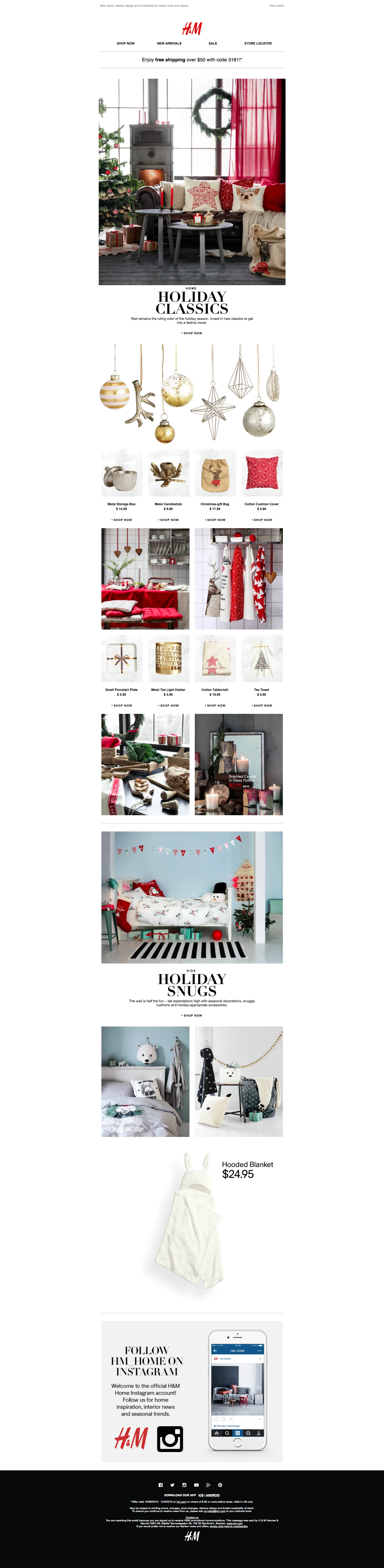
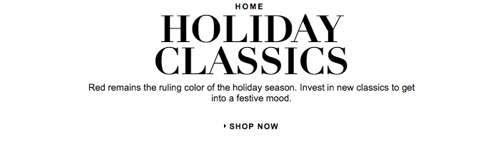
To get started, we’ll put theory into practice by recreating this beautiful H&M holiday campaign:
By the way, if you’re looking for inspiration for your email campaigns, ReallyGoodEmails is the place to go!
Coding emails with MJML
Before we start, let’s get ready to use MJML. There are several ways to code in MJML, such as running it locally or using the online editor. By choosing the online editor, you’ll be able to start immediately, but running it locally enables you to use your favorite email editor (with plugins for Atom, Sublime Text, Vim) and always be up to date with the latest version.
Once you’ve decided which method suits you best, we’re ready to get started. Here is what a basic MJML layout looks like:
Getting started with some styles
In this email by H&M, we can see that there are some elements with similar styles which are used several times, such as the menu and description of the images or the “Shop Now” calls to action.
Creating CSS styles for the “Shop Now” calls to action
<mj-style>
Styling MJML components
Instead of manually adding styles to MJML components, <mj-attributes> enables us to inline MJML styles in various ways. First, it’s possible to apply a style to all components at once, using <mj-all />. In this stage, we’re setting the default padding for all components to 0. We’ll be able to override this default padding by manually setting a new one on the components directly. Then, we can create mj-classes using the <mj-class /> tag, which we will then apply on some MJML components, such as the “preheader” and “menu” mj-classes. Finally, we can set default styles for a component as described here.
Structuring the email
An MJML file is generally made of rows (<mj-section>), which are themselves made of columns (<mj-column>). The only components which are not laid out in columns are high-level components such as <mj-hero> and <mj-navbar>, or <mj-include>. Always remember to wrap content inside a column, even if you only have one column.
Creating the preheader
In this case, we have a simple layout with two columns. Therefore, we just have to create a section that will be composed of two columns, with one of them being wider than the other. To add text in each column, we’ll use <mj-text> components and apply the “preheader” mj-class on them.

Styling the header
H&M Logo
To add the H&M logo, we’ll juste create the section and use the <mj-image> tag to add the image, using the “width” attribute to size it as we wish. Note that, even if there is only one column, the image is nested inside a <mj-column> tag.
Menu
Desktop view When viewed on desktop, the menu is formed of four columns, aligned side-by-side. This layout is again explicit with MJML, we just have to create a section and wrap the four columns inside. To add the menu items, we’ll use the <mj-text> component as we did before, although this time we’ll be applying the “menu” mj-class. The great thing about <mj-text> is that it can contain any HTML, so we’ll just add links to the menu items using the HTML <a> tag. Note that all the <a> tags will be styled according to the CSS styles we added in the <mj-style> definition, in the header of the MJML file. In this case, it means that the text-decoration will be set to none and the text color to black.
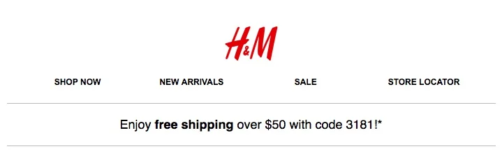
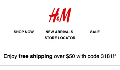
Mobile view We’re almost done, but not just yet! If you scale down the original email, you’ll notice that the layout changes on mobile. The menu keeps the first three items on the same line, while the fourth one (“Store locator”) is broken to the following line. If you try to scale down the MJML email, you’ll see that all columns stack one under the other. Don’t worry though, it’s really easy to prevent columns from stacking, leveraging the <mj-group> component.
To replicate the original email’s behavior, we’ll wrap the first three columns inside a group component and leave the fourth one out. We’ll make sure to add a width of 75% to the group component and a width of 25% to the item that is left out, so that columns are equally split.
Promocode
To replicate this, we actually have two options. We could have used the <mj-divider> component above and below a text component, but we decided to use a section with a border-top and a border-bottom attribute. Aside from the border, there’s nothing really new as we’re once again using the <mj-text> component with HTML inside.
Structuring the body of the email
Main image
This one is really easy (get used to it, you’re doing MJML… we love easy!). All you have to do is use the <mj-image> tag. As the image takes the whole width of the container, you don’t even have to set the width attribute.
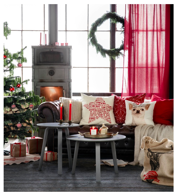
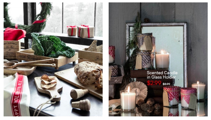
We’ll use the same technique for the snowballs, bed, hooded blanket and Instagram images.
Holiday Classics section
As this is full text, we can just use <mj-text> and define HTML styles on <span> tags to match the original styles of the email (we could also have created CSS classes or MJML classes for those text elements). Note the use of our CSS class “shop-now”.
We’ll use the same technique for the “Holiday Snugs” section.
Four-column images layout
Desktop view Quite similarly to the menu, we have a section that is split into four columns. Inside each column, we’ll use the image and text components. Note that because each image fills the column they’re contained in (minus the padding), we don’t have to manually set the width.
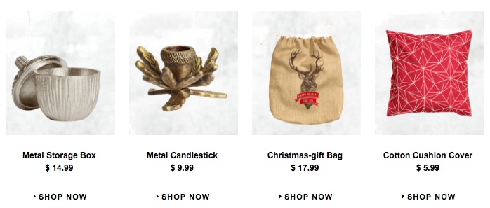
Mobile view In the original email, the mobile layout of this section displays two images, side-by-side. We’ll achieve this by using <mj-group>, just as we did with the menu. This time, we’ll wrap two groups of two columns in a group component so they scale two-by-two on mobile.
Note that we’re using align=”center” on mobile and desktop, while the original email aligns text to the left on desktop and centers text on mobile. It is not possible yet to add media queries in MJML but this is an improvement we’re working on! Obviously, you can also add the media queries to the HTML generated by MJML.
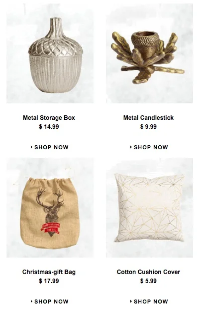
Two-column images layout
This should be easy by now. The only thing we’ll need to do to achieve this layout is to use a section formed of two columns. Once again, there’s no need to set the width and the images will stack automatically on mobile.
Divider
Guess what? There’s a component for that! <mj-divider> enables you to easily add a divider to your email. Cool, isn’t it?
Footer
This section is different from the rest, as the background color fills the whole width of the view port. To achieve this result, all you’ll have to do is use “full-width=’full-width’” on the section component.

Social networks icons
Similarly to what we’ve done before, we’ll wrap six columns in a group component to ensure they don’t stack on mobile. In this case, we’re using the width attribute, as we want the icons to be smaller than the width of the columns.
Footer text
This part is very straightforward, we’ll just wrap the text in a text component and use HTML tags and style to achieve the original result.
H&M Logo
Similarly to the H&M logo in the header, we only have to use the image component with a custom width.
Rendering MJML to HTML and testing
That’s it! We just recreated this beautiful campaign with approximately 430 lines of MJML, while the original file contained more than 1540 lines of HTML.
Before sending our campaign though, it’s good practice to test it on the major email clients we want to target, using a tool such as Litmus or Email on Acid. All we have to do is send or upload the HTML generated by MJML to one of these platforms, which will generate previews for us. Want a sneak peak? Check here what the email looks like in the major email clients, including Yahoo, Gmail Android and Outlook!
Join the community
Of course, we’re sure you don’t just want to be able to replicate H&M’s email, regardless of how cool we think it is. To create your awesome newsletters this Holiday Season, play around, mix and match different bits and pieces and explore the documentation to discover all the available components. You’ll be able to create show-stopping designs in no time.
Already in love with MJML? Come chat and find answers on the MJML Slack, report and contribute on Github, follow us on Twitter and subscribe to the newsletter on https://mjml.io.
Want to define your email strategy to win customers over this holiday season? Check out Mailjet’s Ultimate Guide To Holiday Emailing.
