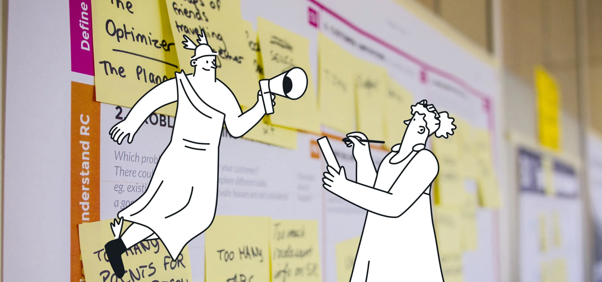
Email best practices
Optimize your transactional email design

When you forget a password and need to reset it, typically, you receive an email to complete the process. Or, when adding several items to your shopping cart on a website, sometimes a friendly reminder arrives via email. These are types of transactional emails that are automatically sent when a user takes a specific action. In general, transactional emails are more successful than traditional promotional emails because recipients usually open the former to view info about a product, confirmation, or shipping. Research by Experian shows that transactional emails offer a two to five times higher return on investment (ROI) than promotional emails.
A transactional email enables companies to influence potential customers to take action (such as buying something from their wish lists or reminding them of any remaining items in their shopping cart). But when a transactional email isn’t well designed, you may miss out on increasing open rates or sales.
Here’s our guide to designing transactional emails that capture your audience’s attention and prompt them to take action.
What is a transactional email?
Promotional emails are a popular form of email marketing that helps inform your audience about your brand and all that it offers. Transactional emails, however, can be a key piece of your marketing campaigns, helping build trust with consumers and delivering excellent customer service. You send subscribers promotional emails to advertise a product or service, but users prompt transactional emails themselves by taking action on your application or website.
Transactional emails enhance your brand’s rapport with a customer by keeping an open line of communication when they make a purchase, sign up for a newsletter, or receive a delivery.
Types of transactional emails
- Welcome emails: After a customer signs up or makes a purchase, they expect to receive a welcome email. This is an excellent opportunity to make a positive first impression and gain new supporters. Some elements you can experiment with include the overall tone, images and colors, and product links.
- Order confirmation emails: This type of transactional email reassures customers that their order was received and provides a convenient way to cross-sell and upsell other items. An excited, upbeat tone can contribute to a purchase, and pertinent information like pricing and expected arrival time keeps customers informed.
- Order shipment emails: After placing an order, a customer is likely excited about receiving it. Providing current shipping information reassures them of its pending delivery and a way to continue building trust with good customer service.
- Password reset emails: With users visiting many websites and having multiple accounts, forgetting passwords is a typical occurrence. Password reset emails not only provide functionality, but they also give you the chance to use a helpful voice and persuade your audience to your brand.
- Cancellation emails: When a user opts out of a subscription, an automatic cancellation email is generated. Although it isn’t a positive outcome, it gives your company the chance to show class and even win back the customer. It also helps identify why a particular user canceled, allowing you to potentially address their specific needs, including pricing, usability, or support.
- Double opt-in emails: This email offers benefits for both senders and subscribers. By adding a second step to the subscription process, you confirm a specific user’s interest, increasing your chances of marketing success. Since it’s a confirmed email address, it reduces the number of spam recipients on your deployment list.
- Delivery confirmation emails: This message completes the order process by notifying the customer that their package has arrived. Besides noting essential information (like the product ordered, price, tracking number, and delivery time), delivery confirmation emails can use a unique personality that helps promote your brand. Examples include company logos, a call-to-action (CTA), or even a photo of the delivery driver.
Three effective tips to improve transactional email design
1. Use content to your advantage
Transactional emails are a prime opportunity to connect with customers and prospects outside the confines of newsletters and promotions. Most of the time, users are already in the conversion funnel when triggered emails are sent, and if they are well-pers귭, you can turn them into paying customers. Including the right supplemental content with your transactional email can help usher prospective clients down the funnel.
Start with the important stuff
Since transactional emails are triggered upon specific user action, you’ll want the user to know right off the bat why they’re receiving this email. Ensure your subject line and introduction focus on why it’s being sent. This enables you to disseminate your important message, even if your audience only reads the first sentence.
Make the most of your content
Getting to the point doesn’t mean you can’t supplement the point with relevant, useful content. You have the reader’s attention, so use it wisely! For example, if you’re sending an email to confirm a new user’s email address, consider linking to your site’s “about us” page or a customer spotlight story on your blog to introduce the new user to your brand. Or, if you’re sending an email thanking a buyer for purchasing, take the opportunity to cross-sell by linking to similar products they may like.
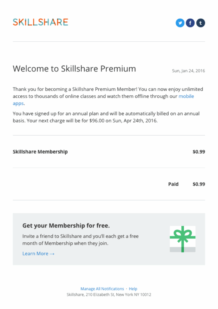
In the example below, Skillshare hits on several essential elements, like the reason for the email, links to its social media channels, and a CTA for a free membership. The colorful and appealing Skillshare logo adds an upbeat feel, and the information quickly gets to the point.
Keep it concise
Most people skim through emails to see if there’s anything that can benefit them. Make sure your primary CTA is crystal clear so your readers know exactly what you want them to do. Use design elements like arrows or boxes to draw the reader’s eye right to the CTA. Use smaller headers and shorter paragraphs or bullet points to call attention to supplemental content.
2. Invest in design
Transactional emails are notorious for being bland. Think about it – when was the last time you received an invoice that didn’t make your eyes glaze over? Investing in the design of your transactional emails is a great way to stand out and engage readers.
Play with color psychology
The colors you use are more than just pretty, they can be powerful! Make strategic use of the rainbow and leverage color psychology. This is especially important with the CTA. Use action-oriented colors like red or orange to drive conversions. You can also use color to section out your email or use different colors to separate the header and footer. Always use complementary colors and limit your palette to two to three colors to avoid visual headaches.
Use images wisely
Images can definitely add to an email, but there’s something to be said about too much of a good thing. Don’t use too many images, or your content might get lost. Also, never lead with an image unless it’s your logo. Make sure you include an introduction, which is then followed by images or photos. Keep your entire email design simple and allow the images to take center stage.
Don’t forget about white space
White space helps visually break your content in a more digestible way. It can also help you emphasize key points and section out different areas of your email. Use white space to make your email feel more spacious, bring attention to important messaging, make your text and visuals pop, and structure the email to make it aesthetically pleasing.
Keep it on-brand
Even if you’re only sending a password confirmation, any communications from your brand should look and feel like your brand. Use brand colors and fonts, and include your logo in the header or footer. Remember to integrate your message with your brand’s tone, voice, and personality. For example, if your brand has a quirky vibe, don’t be afraid to inject humor into the email copy. Your readers will appreciate it!
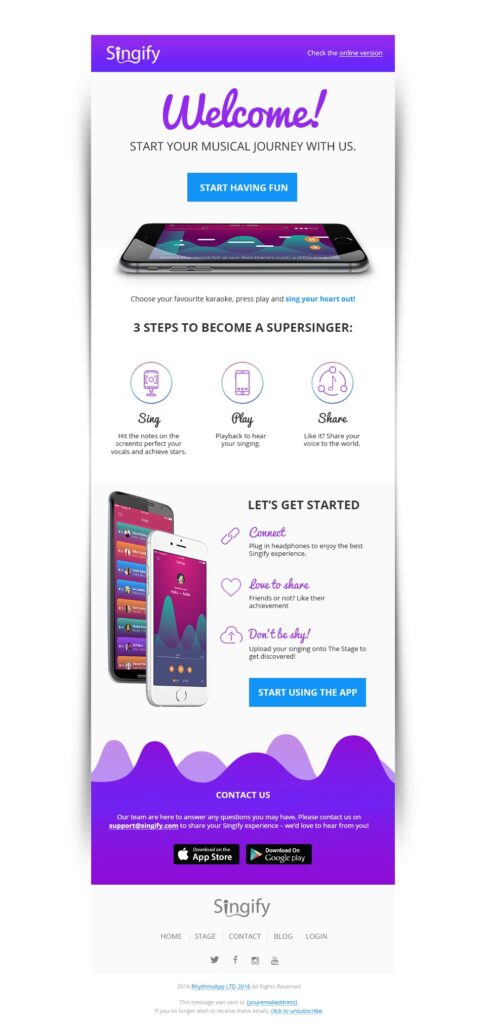
In the following example, Signify uses a vivid, well-organized transactional email that invites recipients to try the app. Bright purple contrasts with ample whitespace to highlight the message, and neatly arranged images lead users to essential details. Signify’s unique logo keeps things on-brand, and large CTAs direct users to the website.
3. Pay attention to layout
If content is king, consider the queen – layout! How you organize and lay out your transactional emails is just as important as what’s in them.
Wise up on width
An email that’s too wide just doesn’t work. If your readers have to scroll from side to side on their devices to read the content, they’ll most likely stop reading and hit delete. Keep your width to 600 pixels to make sure all your content appears on the screen without the need to scroll.
Cultivate the right columns
If you’re including supplemental content you want to highlight, you might be tempted to section your content out into a million columns, but don’t! With the 600px width limit, more than two or three columns feels way too crowded.
Build a hierarchy
No one likes to stare at big blocks of text. It’s visually overwhelming and will remind people of a textbook (or homework). Use text hierarchy – including sub-headers, quotes, and font formatting (bold and italics) – to organize your copy and visually illustrate important points.
Don’t forget about mobile
If your email only works on a desktop, you’re missing out on a ton of opportunities. Many people read their emails on their phones, and if your email isn’t optimized for mobile, all they’ll see is a hot, jumbled mess. Ensure your email design is fully responsive. Your readers should have a positive, well-designed email experience on whatever device they’re using.
Check your email on every application and device to get a sense of user experience (UX) across the board. Keep in mind that UX can leverage customer loyalty. To cover your bases, add a “view in browser” link. That way, if everything else fails and the email still looks wonky on users’ devices, they can view the content as it’s meant to be seen.
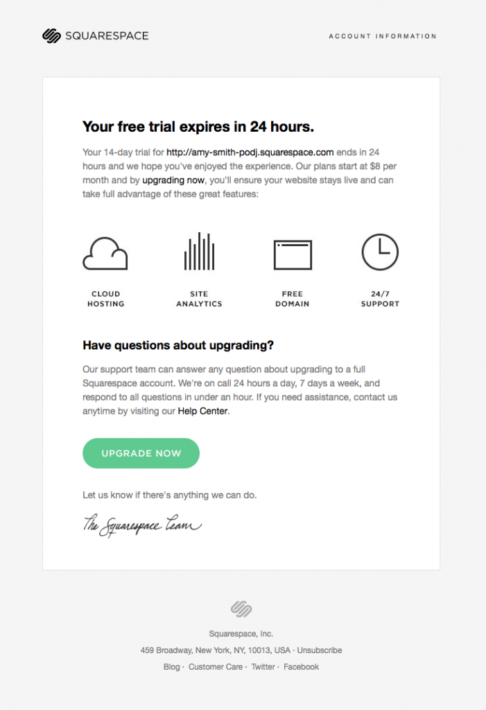
The following email from Squarespace features a tidy layout with different elements neatly arranged throughout. Short blocks of text quickly get to the point, clear icons display vital features, and bold headers draw attention to vital information
Wrapping up
Transactional emails may seem like a straightforward way of communicating information with consumers. When effectively designed, they not only pose a great opportunity to impress the audience, but they also can be an essential piece of your email marketing strategy.
Transactional email templates with a good design invite users to learn more about your brand. Instead of simply conveying facts and figures in a basic format, transactional marketing emails can use design to raise curiosity, build trust, and increase brand awareness.
With these transactional email design tips, you’ll have all the weapons you need to increase engagement and drive conversions.