Email best practices
Dark mode for email survey: What do marketers think?

Does the possibility of dark mode email disasters give you nightmares, or has your team overcome the fear of emails in the dark? Results from our new dark mode survey reveal what keeps email marketers up at night.
The rise in the popularity of dark mode created interesting challenges for many designers and developers. But in the world of email, dark mode challenges can be extra perplexing.
We wanted to know if marketing teams are thinking about dark mode or ignoring it as they design and develop email campaigns. If dark mode email basics are being considered, what are the issues that cause the most frustration?
Pathwire partnered with Ascend2 on an industry survey we call Email After Dark. Check out some highlights from the results in the infographic below.
Key takeaways from Email After Dark
Shedding light on the dark mode survey
Let’s take a closer look at what the Email After Dark survey reveals about the state of dark mode and email marketing. We spoke with Pathwire’s Senior Email Developer, Megan Boshuyzen, and Senior Graphic Designer, Francois Sahli, to get their insights and advice.
Dark mode on your mind?
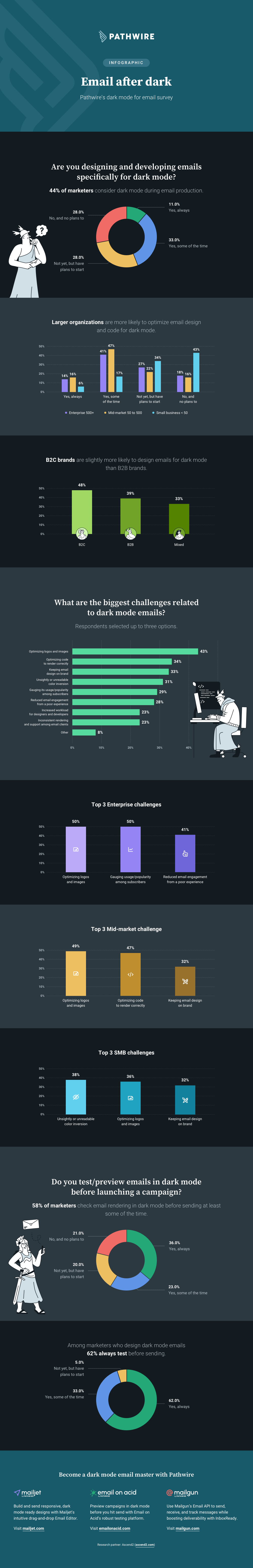
Just 11% of marketers in our survey say they’re always considering dark mode, but that doesn’t paint an accurate picture of dark mode adoption. We also found that only 28% of respondents said they have no plans to address dark mode at all.
That means 72% of the marketers we surveyed have dark mode emails on their radar. A total of 44% are designing emails specifically for dark mode at least some of the time. That could mean they’re creating/using dark-mode-compatible templates. It could also mean they’re coding separate emails for those who prefer light or dark mode.
“What this survey shows is that dark mode is more than just a trend,” says developer Megan Boshuyzen. “Dark mode emails aren’t going anywhere.”
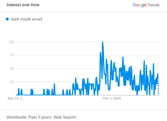
Google Trends data back this up. Check out the graph showing interest in the term dark mode email over the last five years.
The Email After Dark survey also found that small businesses were less likely to consider dark mode than marketers at larger organizations.
The typical small business marketer has multiple roles and responsibilities, which makes it difficult to take on the extra work dark mode email design entails. Plus, small businesses are less likely to have a dedicated email developer around to help out.
The best advice for these marketers is to use email templates that will look good in both light mode and dark mode user experiences.
Top dark mode email challenges
Regardless of company size, or whether marketers are targeting a B2C or B2B audience, some common dark mode challenges emerged in our survey results.
Optimizing logos and images for dark mode
One issue that made the top three regardless of company size or audience is the challenge of getting logos and images to display properly in dark mode.
The typical advice for logos and graphics is to use PNGs with transparent backgrounds. This helps you avoid an unsightly logo or icon surrounded by a white box in dark mode. But, that fix may also create a problem. If parts of your logo are black, they may disappear against a darker background.
A quick fix that’s often recommended is to add a glow or drop shadow to the logo. However, graphic designers like Francois Sahli cringe at that idea, which is seen as sort of an amateur move. Plenty of brand guidelines strictly forbid adding glows and shadows to logos.
Adding glows and drop shadows is basically something you just don’t do in terms of design on a logo. It’s a bit of a touchy subject.
Francois and Megan suggest a few alternatives:
- Placing the logo on a header graphic that uses a brand color and will remain the same in dark mode. You’ll need to be sure the header and logo create an acceptable mobile experience. The logo could look very small on a mobile device.
- Using the CSS query @media (prefers-color-scheme) and apply classes to show or hide the logo you want. Be aware that the prefers-color-scheme media query is not supported in Gmail and certain versions of Outlook.
- Placing the logo on a gradient that gradually blends into the background of the email. Keep in mind, using a gradient with a logo may not work with every email design or follow your brand’s style guidelines.
Optimizing email code for dark mode
Overall, coding struggles related to dark mode emails ranked second highest among the survey’s most-cited challenges. Yet, it only made the top three for mid-market organizations. Smaller companies are less likely to optimize email code and enterprise organizations may already have dark mode figured out.
If you’re part of a marketing team that does have email developers working on campaigns, there are some ways to adjust your code to create a better subscriber experience. That mainly pertains to using the @media (prefers-color-scheme) query to deliver a different experience based on whether a subscriber’s inbox is using dark or light settings.
Unfortunately, this won’t work with some major email clients such as Gmail. As of this writing, it only works with those that use WebKit as the email rendering engine.
Megan Boshuyzen says email developers should always strive to deliver an ideal experience for subscribers. Despite the lack of wide support, using @media (prefers-color-scheme) will work for many subscribers viewing emails on Apple devices. So, taking the time to add the code may be worth the effort.
There are also some specific dark mode coding fixes for Gmail and Outlook that help optimize the inbox experience for other subscribers. However, Francois and Megan remind us that at some point you’ve got to move on and hit send.
There’s no such thing as pixel perfection in email. The goal has to be to provide the best experience possible for subscribers.

Francois points out that it’s highly unlikely your subscribers will be comparing your email design in different inboxes. Go for consistency if you can, but don’t sweat the small stuff.
“If there are small discrepancies in dark mode, it’s not the end of the world,” says Francois. “Unless it’s a very important element of the email, it may not be worth trying so hard.”
Keeping email designs on brand
Concerns over the brand experience in dark mode emails also rose to the top of the list of challenges in the survey. A third of all respondents called it a problem, and that percentage was about the same across company sizes.
Because some email clients will invert an email’s colors, it may feel like the dark mode brand experience is out of your control. That could be why our survey found 31% of marketers call automatic color inversion one of the biggest dark mode challenges.
Certain email clients reverse all the colors in an email while others only partially invert colors, (typically the background and text). In the case of full inversion, you can get some funky colors combinations that may be totally off-brand
Francois’ advice for email marketers is to keep designs as simple as possible. That way, you’ll have fewer issues with color inversion.
“If the CSS elements of an email use mostly black, white, and neutral colors, you can still add your brand colors with things like logos, illustrations, and icons,” Francois explains. “These wouldn’t be inverted, so you’d stay closer to your actual branding.”
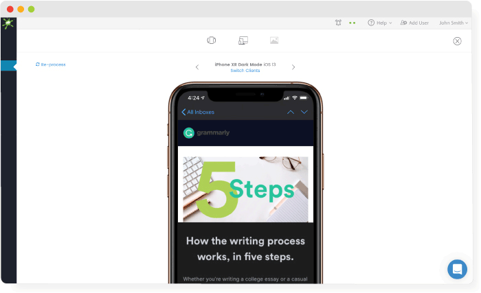
Notice how Nike uses a simple black and white design to build ideal experiences in light and dark mode emails.

Francois adds that a type of email element you should watch carefully is the CTA button. These are typically coded with a specific brand color that may not be ideal when inverted.
Because dark mode is more than a passing trend, both Megan and Francois think it would be smart to start including dark mode options in brand style guides and design systems. If you’re rethinking brand colors or building a new brand, make dark mode part of the conversation. This will benefit email designs, and it’s also important for web development as well as dark mode UI in application development.
Why test emails in dark mode?
The Email After Dark survey found that 36% of marketers are always testing emails in dark mode or previewing them before hitting send. That’s more than triple the 11% who say they always design and develop specifically for dark mode.
Among those who say they design for dark mode at least some of the time, 62% say they always test/preview their emails. Testing before you launch an email campaign is like seeing into the future. It’s the best way to catch potential issues in dark mode before it’s too late.
There are two ways to test your emails in dark mode:
- Manually send the email to various devices and inboxes and view them in dark mode.
- Use a state-of-the-art email testing platform to deliver reliable previews of your emails on all major clients and devices.
Manual testing can be time-consuming and unreliable. It’s usually done by finding people in the company who have a certain type of phone and can access a certain mailbox provider. Plus, you’ll also have to get those colleagues to turn dark mode settings on.
Email on Acid by Pathwire is an AI-driven email readiness platform that delivers accurate previews from all of the major email clients and more. That includes dark mode email previews that help you catch unsightly design issues and color inversions before your subscribers see them.
Dark mode challenges could make it harder for a segment of your list to interact with your emails. If they can’t read the text or see a CTA, they can’t engage. That’s why 28% of survey respondents call reduced engagement a challenge. Dark mode email testing helps you avoid that possibility.
6 quick tips for dark mode emails
Here’s a recap of the advice Megan and Francois have for email developers and designers:
- Don’t ignore dark mode: A significant portion of your list is likely viewing emails this way. Plus, by ignoring dark mode, you could be giving the competition an edge.
- Use dark-mode-friendly templates: This advice is best for marketers without coding experience who are using a drag-and-drop email editor.
- Find a dark mode logo fix that works for you: That could mean compromising on adding a glow or getting creative with a different dark mode logo solution.
- Start implementing @media (prefers-color-scheme): Doing so helps you optimize the dark mode email experience for many subscribers.
- Keep email designs simple: You’ll avoid unfortunate color inversions that are off-brand and ugly.
- Include dark mode styles in brand guidelines: Develop a clear plan for dark mode email challenges. Define what dark mode looks like for your brand. That could include building a library of email elements that work in dark mode.
Interest in dark mode among email marketers is going to grow. The Email After Dark survey found that 28% say they have plans to start designing and developing emails for dark mode. Don’t be one of the brands that get left in the dark. Start thinking about how you can address these challenges and start testing emails in dark mode.
Be sure to catch Megan Boshuyzen’s session on dark mode at Pathwire’s Nightmare at Email Camp.
Want to stay on top of all the email marketing trends? Sign up for our newsletter and get our content in your inbox every other week.